Edit chart
Loading graph
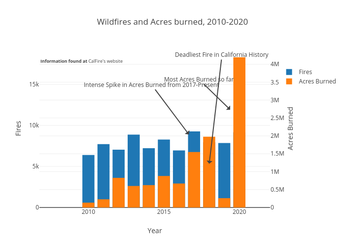
Epicfox's interactive graph and data of "Wildfires and Acres burned, 2010-2020" is a bar chart, showing Fires vs Acres Burned; with Year in the x-axis and Fires in the y-axis.. The x-axis shows values from 2009.5 to 2020.5. The y-axis shows values from 0 to 18671.61064181809. This visualization has the following annotations: Most Acres Burned so far; Deadliest Fire in California History; Intense Spike in Acres Burned from 2017-Present; Information found at CalFire's website