Edit chart
Loading graph
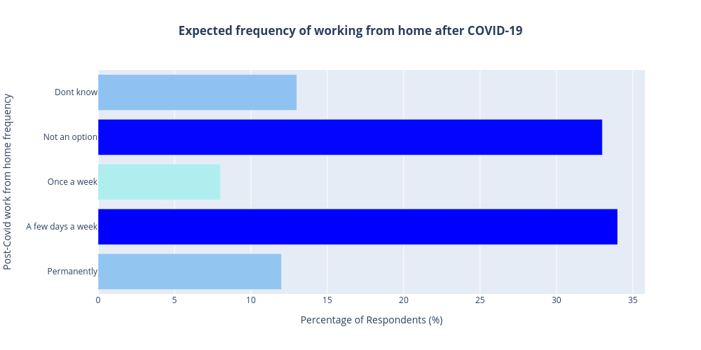
Darylhughes's interactive graph and data of "Expected frequency of working from home after COVID-19" is a bar chart; with Percentage of Respondents (%) in the x-axis and Post-Covid work from home frequency in the y-axis.. The x-axis shows values from 0 to 0. The y-axis shows values from 0 to 0.