Edit chart
Loading graph
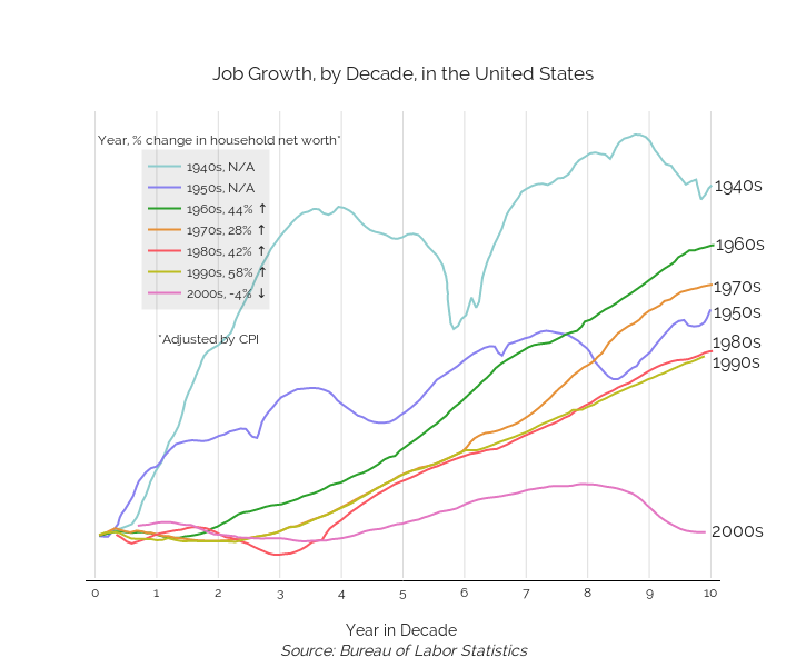
Beths's interactive graph and data of "Job Growth, by Decade, in the United States" is a scatter chart, showing 1940s, N/A, 1950s, N/A, 1960s, 44% ↑ , 1970s, 28% ↑ , 1980s, 42% ↑ , 1990s, 58% ↑ , 2000s, -4% ↓ ; with Year in Decade Source: Bureau of Labor Statistics in the x-axis. The x-axis shows values from -0.1 to 10.1. The y-axis shows values from -4.4855578849289515 to 46.189960400652225. This visualization has the following annotations: 1940s; 1950s; 1960s; 1970s; 1980s; 1990s; 2000s; Year, % change in household net worth*; *Adjusted by CPI