Edit chart
Loading graph
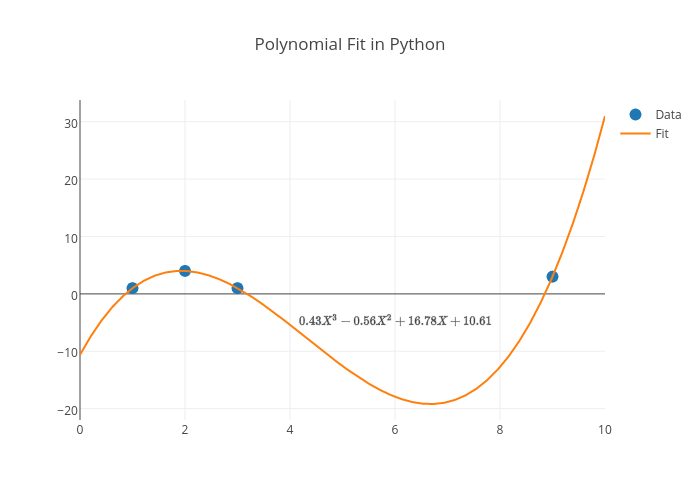
Adamkulidjian's interactive graph and data of "Polynomial Fit in Python" is a scatter chart, showing Data vs Fit. The x-axis shows values from 0 to 0. The y-axis shows values from 0 to 0. This visualization has the following annotation: $0.43X^3 - 0.56X^2 + 16.78X + 10.61$