

Plot Data from Salesforce in Python/v3
Create interactive graphs with salesforce, IPython Notebooks and Plotly
See our Version 4 Migration Guide for information about how to upgrade.
New to Plotly?
Plotly's Python library is free and open source! Get started by downloading the client and reading the primer.
You can set up Plotly to work in online or offline mode, or in jupyter notebooks.
We also have a quick-reference cheatsheet (new!) to help you get started!
Version Check
Plotly's python package is updated frequently. Run pip install plotly --upgrade to use the latest version.
import plotly
plotly.__version__
Imports
Salesforce reports are great for getting a handle on the numbers but Plotly allows for interactivity not built into the Reports Module in Salesforce. Luckily Salesforce has amazing tools around exporting data, from excel and csv files to a robust and reliable API. With Simple Salesforce, it's simple to make REST calls to the Salesforce API and get your hands on data to make real time, interactive charts.
This notebook walks you through that basic process of getting something like that set up. First you'll need Plotly. Plotly is a free web-based platform for making graphs. You can keep graphs private, make them public, and run Plotly on your own servers (https://plotly.com/product/enterprise/). To get started visit https://plotly.com/python/getting-started/ . It's simple interface makes it easy to get interactive graphics done quickly.
You'll also need a Salesforce Developer (or regular Salesforce Account). You can get a salesforce developer account for free at their developer portal.
import plotly.plotly as py
import plotly.graph_objs as go

import pandas as pd
import numpy as np
from collections import Counter
import requests

from simple_salesforce import Salesforce
requests.packages.urllib3.disable_warnings() # this squashes insecure SSL warnings - DO NOT DO THIS ON PRODUCTION!
Log In to Salesforce
I've stored my Salesforce login in a text file however you're free to store them as environmental variables. As a reminder, login details should NEVER be included in version control. Logging into Salesforce is as easy as entering in your username, password, and security token given to you by Salesforce. Here's how to get your security token from Salesforce.
with open('salesforce_login.txt') as f:
    username, password, token = [x.strip("\n") for x in f.readlines()]
sf = Salesforce(username=username, password=password, security_token=token)
SOQL Queries
At this time we're going to write a simple SOQL query to get some basic information from some leads. We'll query the status and Owner from our leads. Further reference for the Salesforce API and writing SOQL queries: http://www.salesforce.com/us/developer/docs/soql_sosl/ SOQL is just Salesforce's version of SQL.
leads_for_status = sf.query("SELECT Id, Status, Owner.Name FROM Lead")
Now we'll use a quick list comprehension to get just our statuses from those records (which are in an ordered dictionary format).
statuses = [x['Status'] for x in leads_for_status["records"]]
status_counts = Counter(statuses)
Now we can take advantage of Plotly's simple IPython Notebook interface to plot the graph in our notebook.
data = [go.Bar(x=status_counts.keys(), y=status_counts.values())]
py.iplot(data, filename='salesforce/lead-distributions')
While this graph gives us a great overview what status our leads are in, we'll likely want to know how each of the sales representatives are doing with their own leads. For that we'll need to get the owners using a similar list comprehension as we did above for the status.
owners = [x['Owner']['Name'] for x in leads_for_status["records"]]
For simplicity in grouping the values, I'm going to plug them into a pandas DataFrame.
df = pd.DataFrame({'Owners':owners, 'Status':statuses})
Now that we've got that we can do a simple lead comparison to compare how our Sales Reps are doing with their leads. We just create the bars for each lead owner.
lead_comparison = []
for name, vals in df.groupby('Owners'):
    counts = vals.Status.value_counts()
    lead_comparison.append(Bar(x=counts.index, y=counts.values, name=name))
py.iplot(lead_comparison, filename='salesforce/lead-owner-status-groupings')
What's great is that plotly makes it simple to compare across groups. However now that we've seen leads, it's worth it to look into Opportunities.
opportunity_amounts = sf.query("SELECT Id, Probability, StageName, Amount, Owner.Name FROM Opportunity WHERE AMOUNT < 10000")
amounts = [x['Amount'] for x in opportunity_amounts['records']]
owners = [x['Owner']['Name'] for x in opportunity_amounts['records']]
hist1 = go.Histogram(x=amounts)
py.iplot([hist1], filename='salesforce/opportunity-probability-histogram')
df2 = pd.DataFrame({'Amounts':amounts,'Owners':owners})
opportunity_comparisons = []
for name, vals in df2.groupby('Owners'):
    temp = Histogram(x=vals['Amounts'], opacity=0.75, name=name)
    opportunity_comparisons.append(temp)
layout = go.Layout(
    barmode='stack'
)
fig = go.Figure(data=opportunity_comparisons, layout=layout)
py.iplot(fig, filename='salesforce/opportunities-histogram')
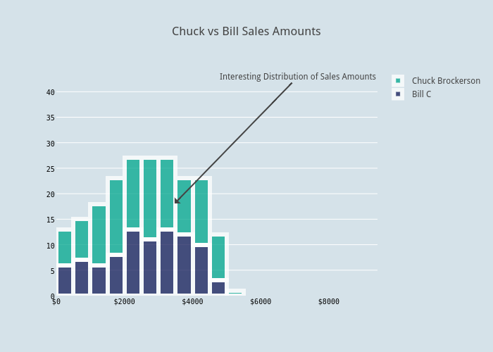
By clicking on the "play with this data!" you can export, share, collaborate, and embed these plots. I've used it to share annotations about data and try out more colors. The GUI makes it easy for less technically oriented people to play with the data as well. Check out how the above was changed below or you can follow the link to make your own edits.
from IPython.display import HTML
HTML("""<div>
    <a href="https://plotly.com/~bill_chambers/21/" target="_blank" title="Chuck vs Bill Sales Amounts" style="display: block; text-align: center;"><img src="https://plotly.com/~bill_chambers/21.png" alt="Chuck vs Bill Sales Amounts" style="max-width: 100%;width: 1368px;"  width="1368" onerror="this.onerror=null;this.src='https://plotly.com/404.png';" /></a>
    <script data-plotly="bill_chambers:21" src="https://plotly.com/embed.js" async></script>
</div>""")
After comparing those two representatives. It's always helpful to have that high level view of the sales pipeline. Below I'm querying all of our open opportunities with their Probabilities and close dates. This will help us make a forecasting graph of what's to come soon.
large_opps = sf.query("SELECT Id, Name, Probability, ExpectedRevenue, StageName, Amount, CloseDate, Owner.Name FROM Opportunity WHERE StageName NOT IN ('Closed Lost', 'Closed Won') AND Amount > 5000")
large_opps_df = pd.DataFrame(large_opps['records'])
large_opps_df['Owner'] = large_opps_df.Owner.apply(lambda x: x['Name']) # just extract owner name
large_opps_df.drop('attributes', inplace=True, axis=1) # get rid of extra return data from Salesforce
large_opps_df.head()
scatters = []
for name, temp_df in large_opps_df.groupby('Owner'):
    hover_text = temp_df.Name + "<br>Close Probability: " + temp_df.Probability.map(str) + "<br>Stage:" + temp_df.StageName
    scatters.append(
        go.Scatter(
            x=temp_df.CloseDate,
            y=temp_df.Amount,
            mode='markers',
            name=name,
            text=hover_text,
            marker=dict(
                size=(temp_df.Probability / 2) # helps keep the bubbles of managable size
            )
        )
    )
data = scatters
layout = go.Layout(
    title='Open Large Deals',
    xaxis=dict(
        title='Close Date'
    ),
    yaxis=dict(
        title='Deal Amount',
        showgrid=False
    )
)
fig = go.Figure(data=data, layout=layout)
py.iplot(fig, filename='salesforce/open-large-deals-scatter')
Plotly makes it easy to create many different kinds of charts. The above graph shows the deals in the pipeline over the coming months. The larger the bubble, the more likely it is to close. Hover over the bubbles to see that data. This graph is ideal for a sales manager to see how each of his sales reps are doing over the coming months.
One of the benefits of Plotly is the availability of features.
References
