JSON Tree Editor
How to use the JSON tree editor in Chart Studio to edit your plots.
Try an Example
The first step is to head to Chart Studio Workspace and check out an example. First, select the 'Type' menu. Hovering the mouse over a chart type icon will display three options: 1) Charts like this by Chart Studio users, 2) View tutorials on this chart type, and, 3) See a basic example.
Clicking the 'See a basic example' option will show what a sample chart looks like after adding data and editing with the style. You'll also see what labels and style attributes were selected for this specific chart, as well as the end result.
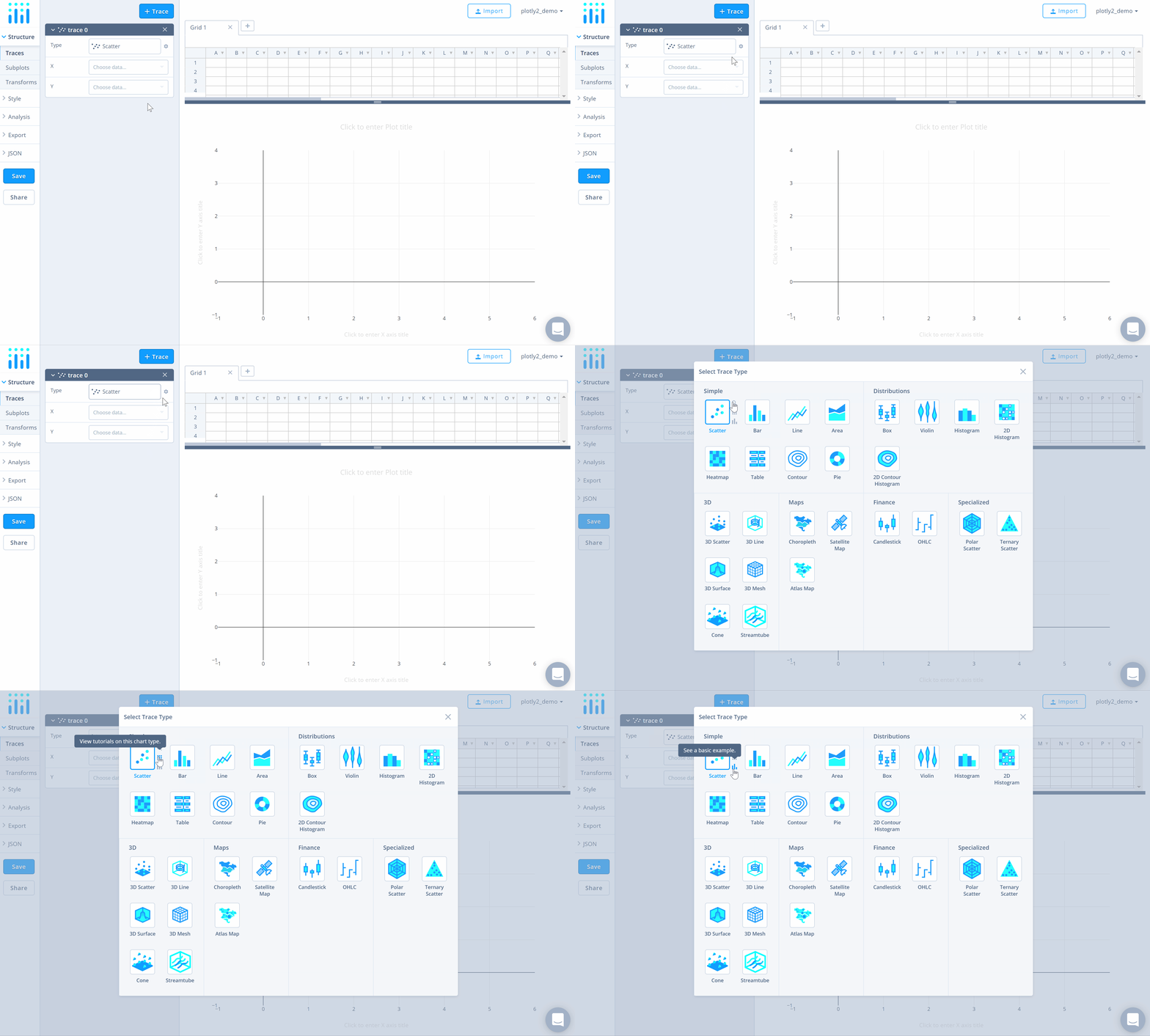
This is a great way to get yourself acquainted with not only the JSON editor, but also with the Chart Studio Workspace itself.
You can use the data featured in this tutorial by clicking on 'Open This Data in Chart Studio' on the left-hand side. It'll open in the Chart Studio.
You can also add your own data. You have the option of typing directly in the grid, uploading your file, or entering the URL of an online dataset. Chart Studio accepts .xls, .xlsx, or .csv files. For more information on how to enter your data, see this tutorial.
After adding the data, go to the 'Traces' section under the 'Structure' menu, then choose the desired 'Type' of trace.
JSON Editor
Once the chart is created, you can style your chart via the 'Style' menu or 'JSON' menu. To learn more about styling the chart via the 'Style' menu, visit the style and layout section of the Chart Studio documentation.
After clicking the 'JSON' menu, head to the 'Tree' section which will reveal the JSON tree of your chart within the panel. You'll see that the tree consists of three objects: 'data', 'layout' and 'frames'.
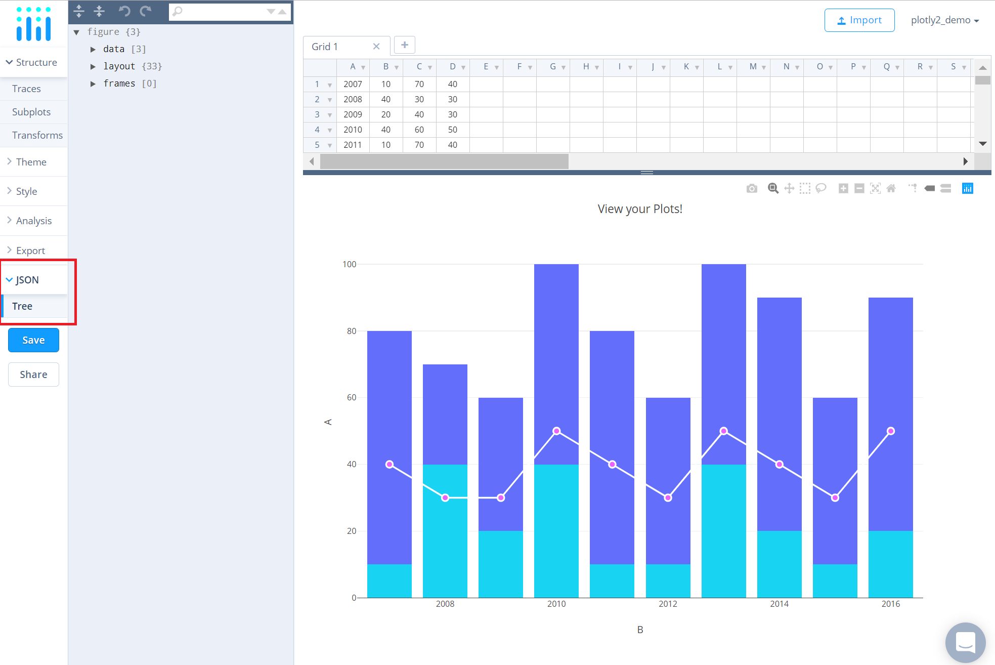
As you're going through the attributes in this panel, its a good idea to have the plotly.js reference opened in a new tab to help you out in case you need an explanation about a certain attribute.
Data
Although this object is labeled as 'data', it's important to note that you cannot edit your data here. To do that, follow this tutorial.
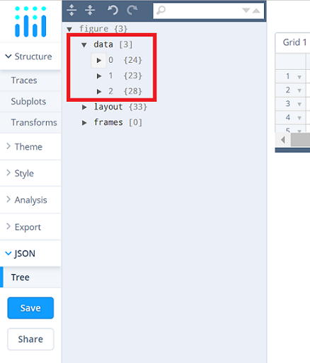
There are three parts to this 'data' object because when this plot was created, three traces were added to it. Each of these 'Traces' contain the same editable properties and can be edited to individually style each trace.
This is where you can change the trace properties such as the trace name, thickness of the lines, marker size, symbol, point diameter, colors for each element of the trace, etc.
Let's consider an instance where we want to change the marker symbol from 'circle' to 'cross' for the scatter trace in the plot. To cross-check if the symbol 'cross' is available, head to the reference page, as mentioned earlier, and navigate to the symbols attribute under the marker property for the 'Scatter' type chart. It looks like 'cross' is available on that list.
Now, head to the scatter trace's properties in the JSON tree. In this plot, the scatter trace is added in the last, hence, click on the last object ('2') to reveal its properties and then click on the property 'marker' to reveal the marker attributes.
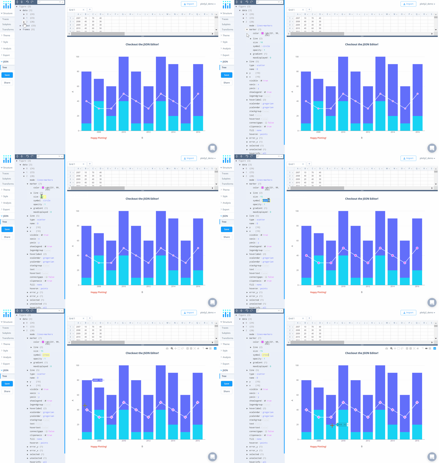
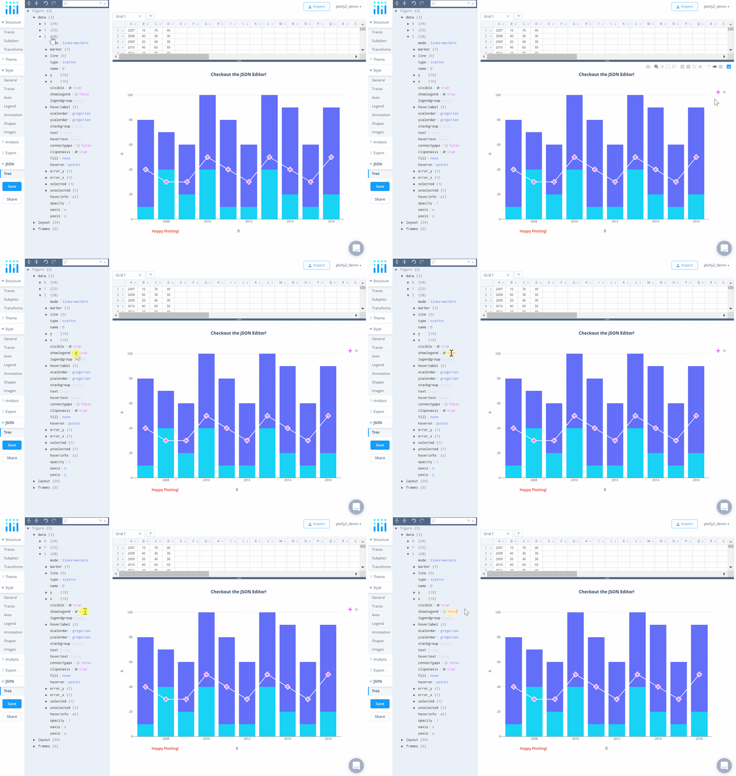
To change the value for an attribute, hover your mouse over the field next to it as seen above and type directly into the field, or select/unselect the checkbox, if available. See the image below for a quick example for selecting/unselecting a checkbox.
Layout
This is the object that describes the overall display of the plot, including the plot/axes title, annotations, shapes, legend positioning, etc. Unlike the 'data' object, the 'layout' object isn't divided by the traces, but by the sections of the plot.
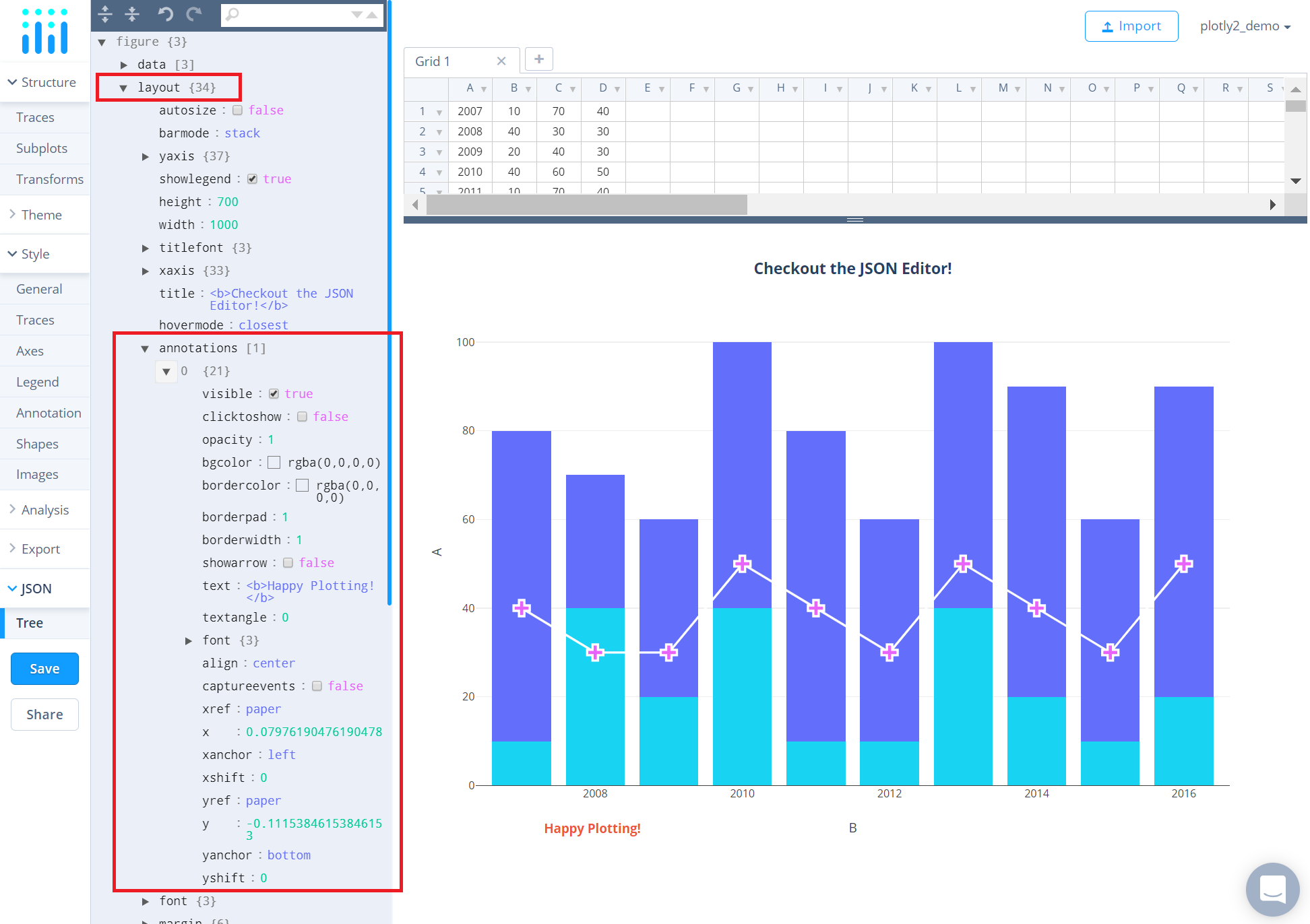
The 'annotations' property under the 'layout' object allows you to edit your annotations. Note that you can not add any new annotations in the JSON tree editor. To add a new annotation, head to the 'Annotation' section under the 'Style' menu. To learn more about how to add annotations, please visit this tutorial.
Now looking at the JSON tree, you can see that we have one annotation on the chart. You can change the attributes associated with that annotation directly within this panel without even navigating to the 'Annotation' section.
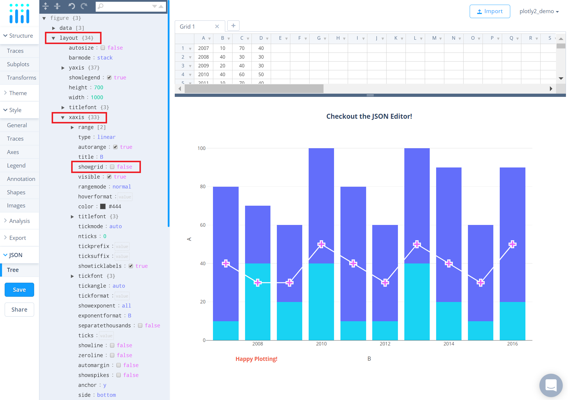
Let's consider another instance: removing the grid lines in the X axis. For this, head to the property 'xaxis' and select the checkbox next to the attribute 'showgrid' or type 'false' directly in the field next to it. To do the same for Y axis, head to the property 'yaxis'.
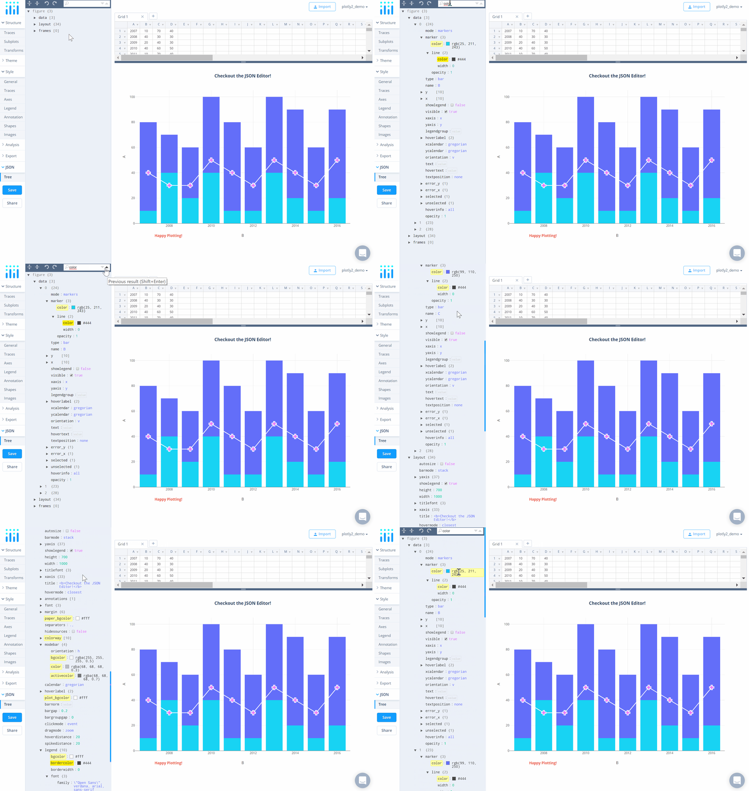
You can also make use of the search box on the top-right corner of the panel to find the appropriate fields or values that you are looking for to modify. Use the down/up arrows available on the right side of the search box to navigate to the next/previous field respectively, if more than one field is available matching the text you entered.
Frames
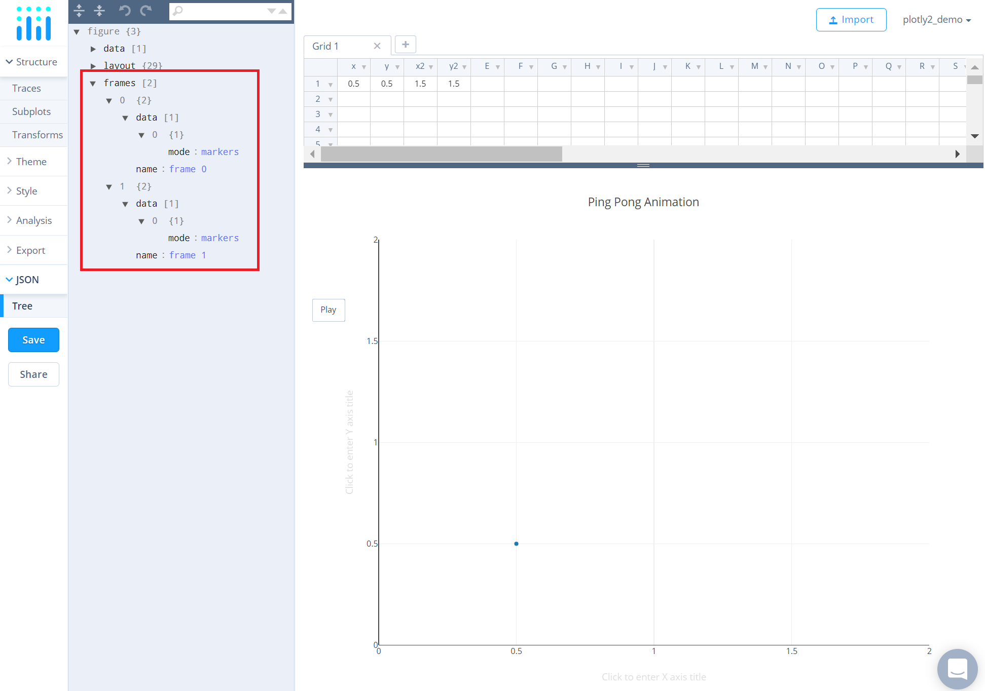
The 'frames' object comprises elements associated with any animation within the chart. Unfortuantely, Chart Studio does not support creations of animations within the workspace. However, animated charts can be created programmatically, and once created, can then be edited in the workspace via the JSON editor. To learn more about how to create animations programmatically, check out these tutorials: Plotly.js, Python, and R.
Here is a sneak peak of the 'frames' object in the JSON editor when a chart has an animation. Note that the number of objects under 'frames' correspond to the number of frames associated with the animation. In this example below, the chart contains only two frames.
