
How to Add a Range Slider
Learn to add a range slider and timescale buttons to a time-series chart using Plotly's Chart Studio.
Getting Started
The interactive range slider allows users to select and drilldown into specific areas of the graph. It is a great way to display a specific range within your chart, especially for time series plots.
You can check out an example by clicking on 'Open This Data in Chart Studio' on the left-hand side. It'll open the plot and data fatured in this tutorial in Chart Studio.
Add Your Data
Head to Chart Studio and add your data. You have the option of typing directly in the grid, uploading your file, or entering a URL of an online dataset. Chart Studio accepts .xls, .xlsx, or .csv files. For more information on how to enter your data, see this tutorial.
Create a Chart
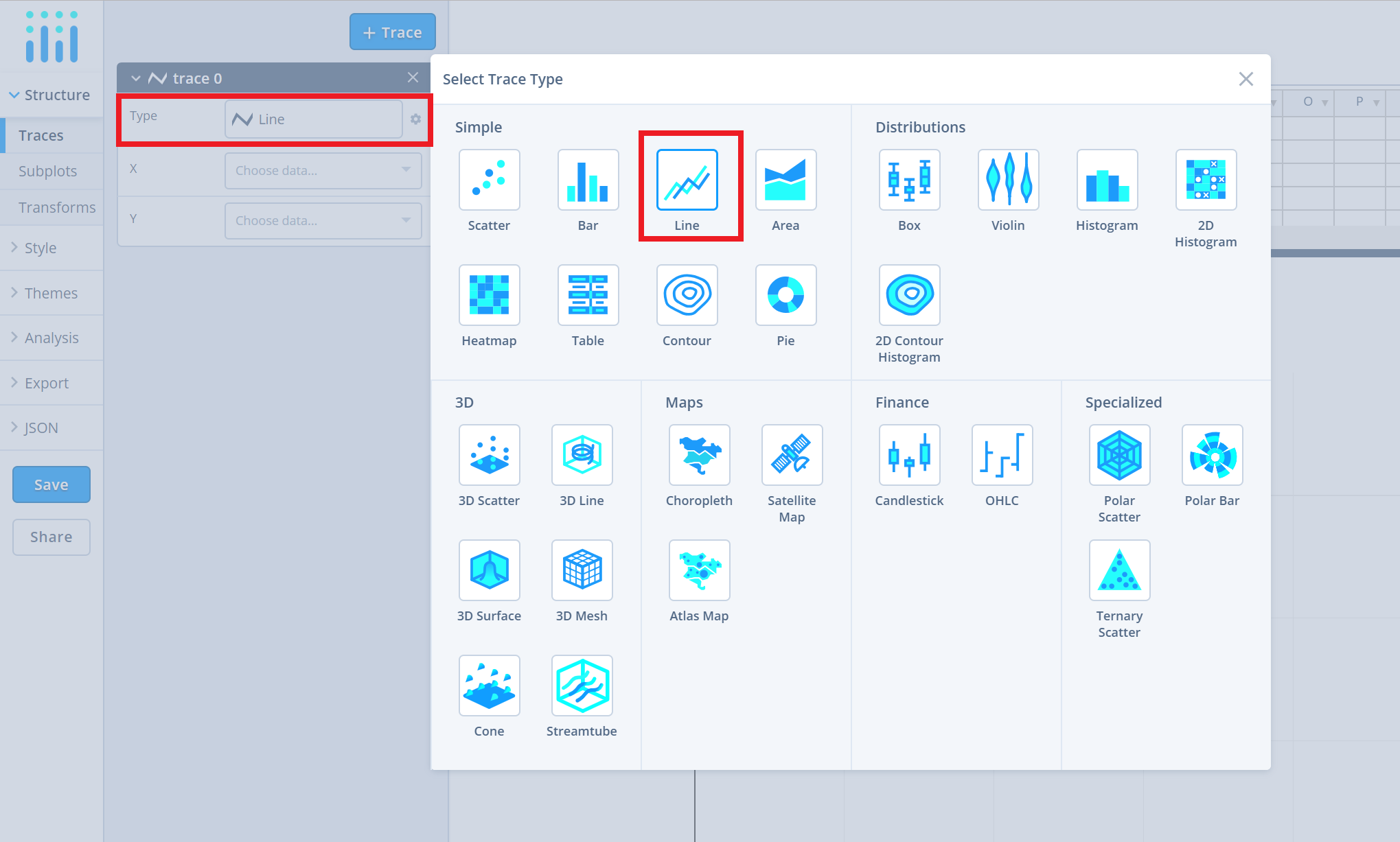
After adding data, go to the 'Traces' section under the 'Structure' menu on the left-hand side. Choose the 'Type' of trace, then choose 'Line' under 'Simple' chart type.
Next, select the 'X'and 'Y' values from the dropdown menus. This will add a raw line trace to the chart as seen below.
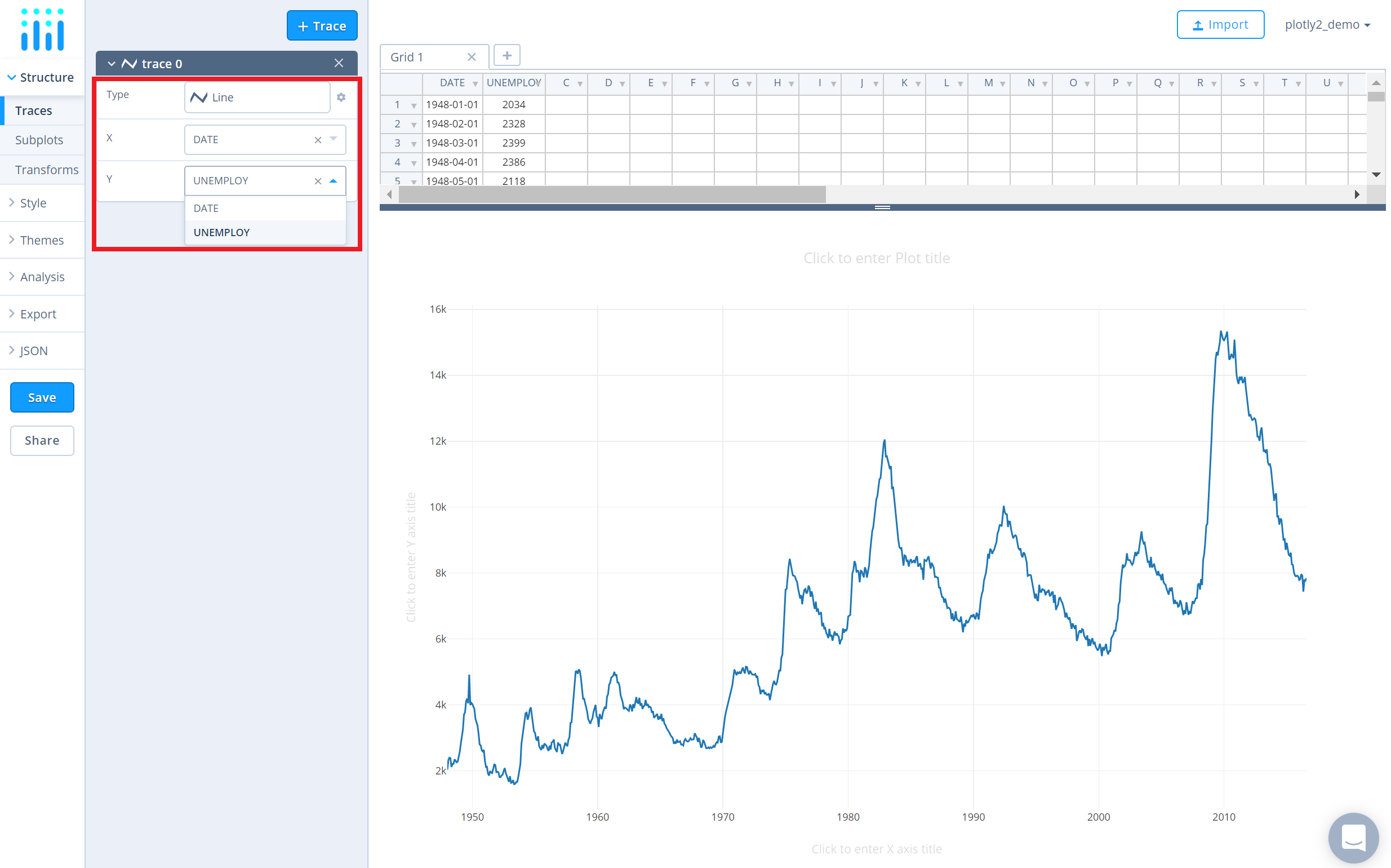
If you're creating a plot with dates and/or times, it's very important to format your data correctly, so make sure to check out this page first.
Style a Chart
The 'Style' menu displays many options to modify characteristics of the overall chart layout or the individual traces. To see more options about styling the chart, visit the style and layout section of the Chart Studio documentation.
Use the 'General' section under the 'Style' menu to change the general style properties such as plot background color, margin color and font sytlings and other layout properties.
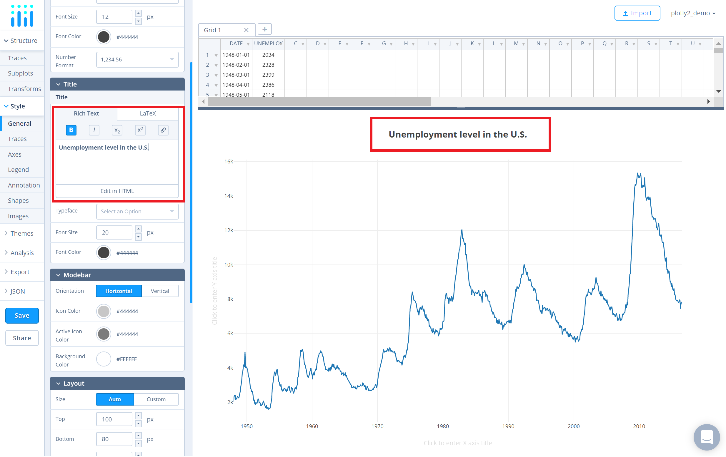
To set the plot title, type the title text within the textbox provided under the 'Title' property.
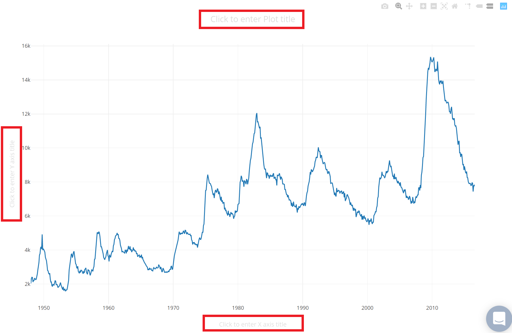
Another approach is to click and then enter the title directly on the plot interface. The same can be done for the axes title.
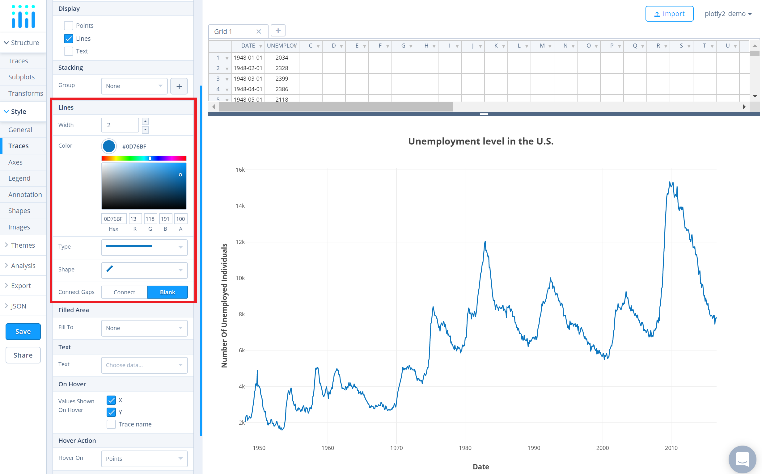
Use the 'Traces' section under the 'Style' menu to change the trace properties such as line color, width and shape.
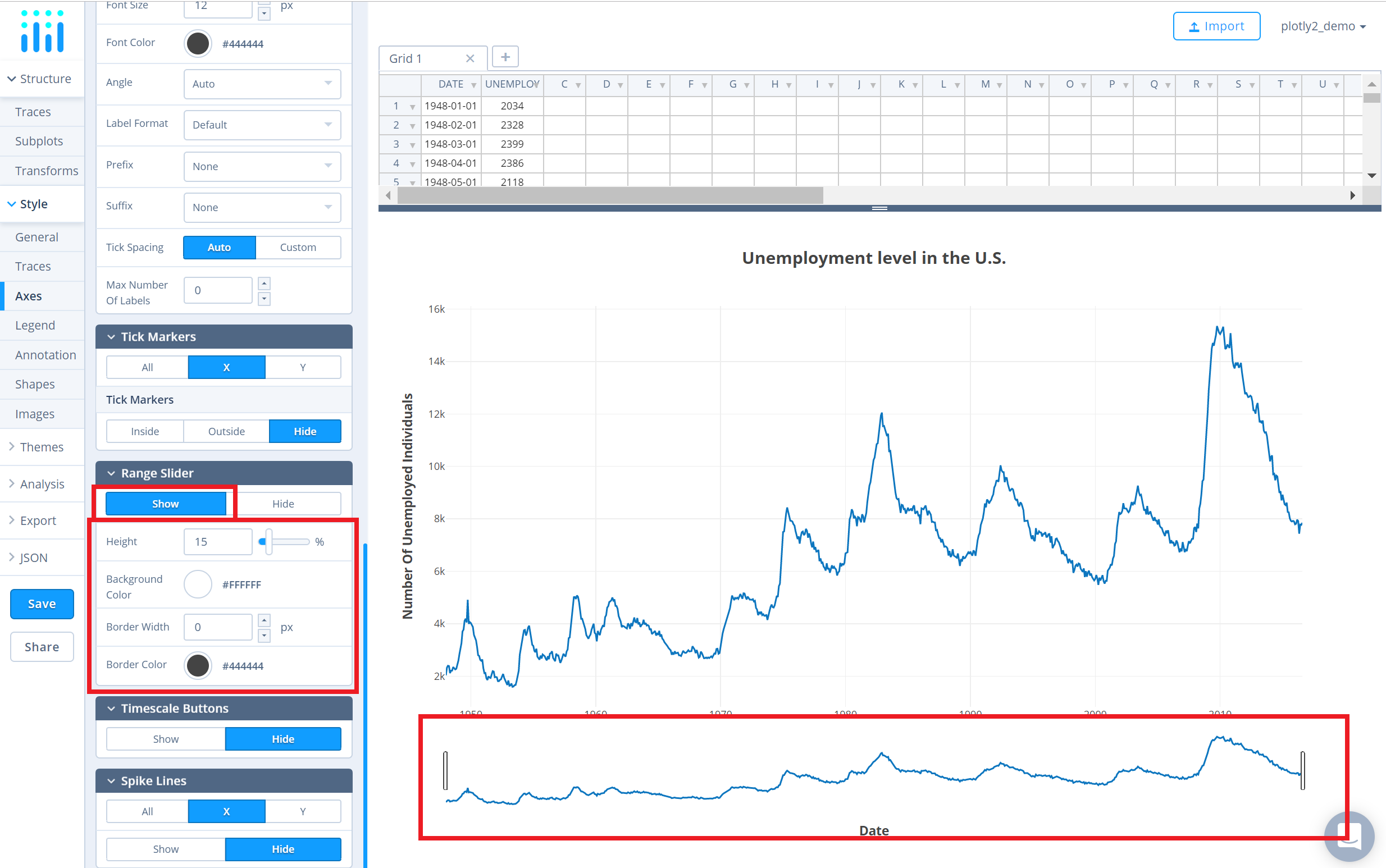
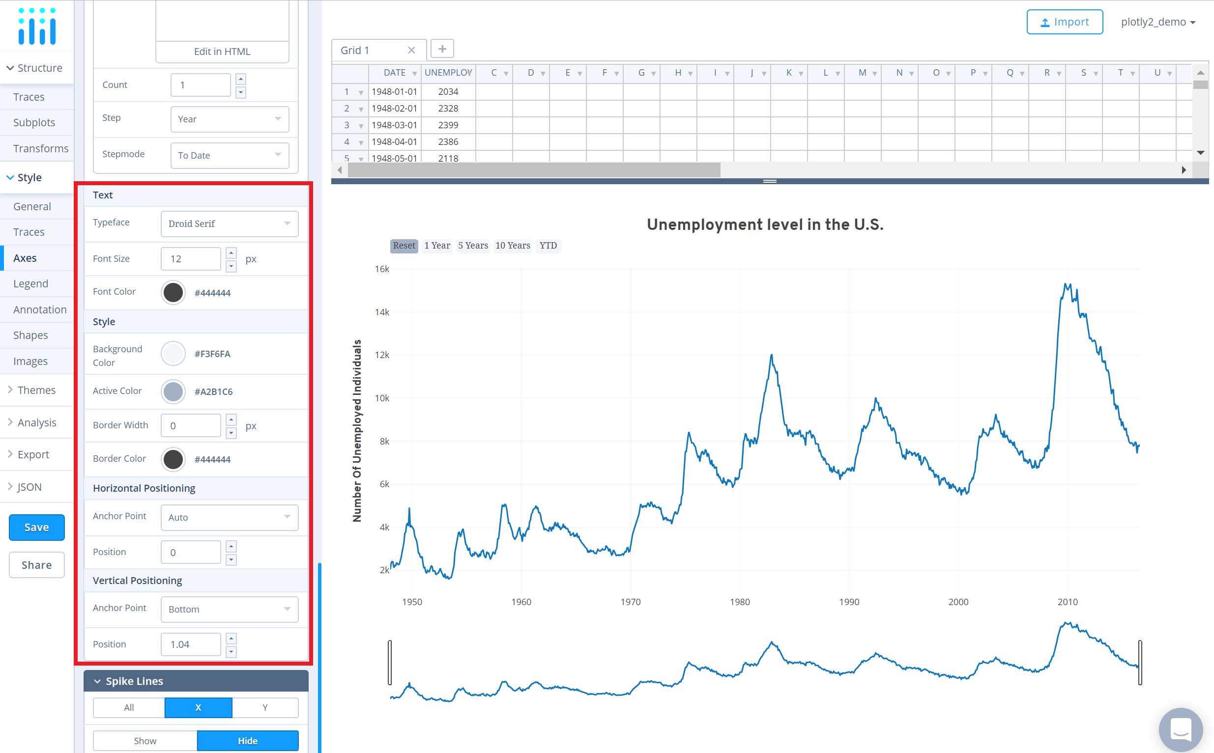
After you've plotted and styled your chart, you're ready to add the range slider to the chart. To do that, go to the 'Axes' section under the 'Style' menu and click 'Show' under the 'Range Slider' property. This will display the range slider under the plot and the style settings specific to the range slider under the property itself.
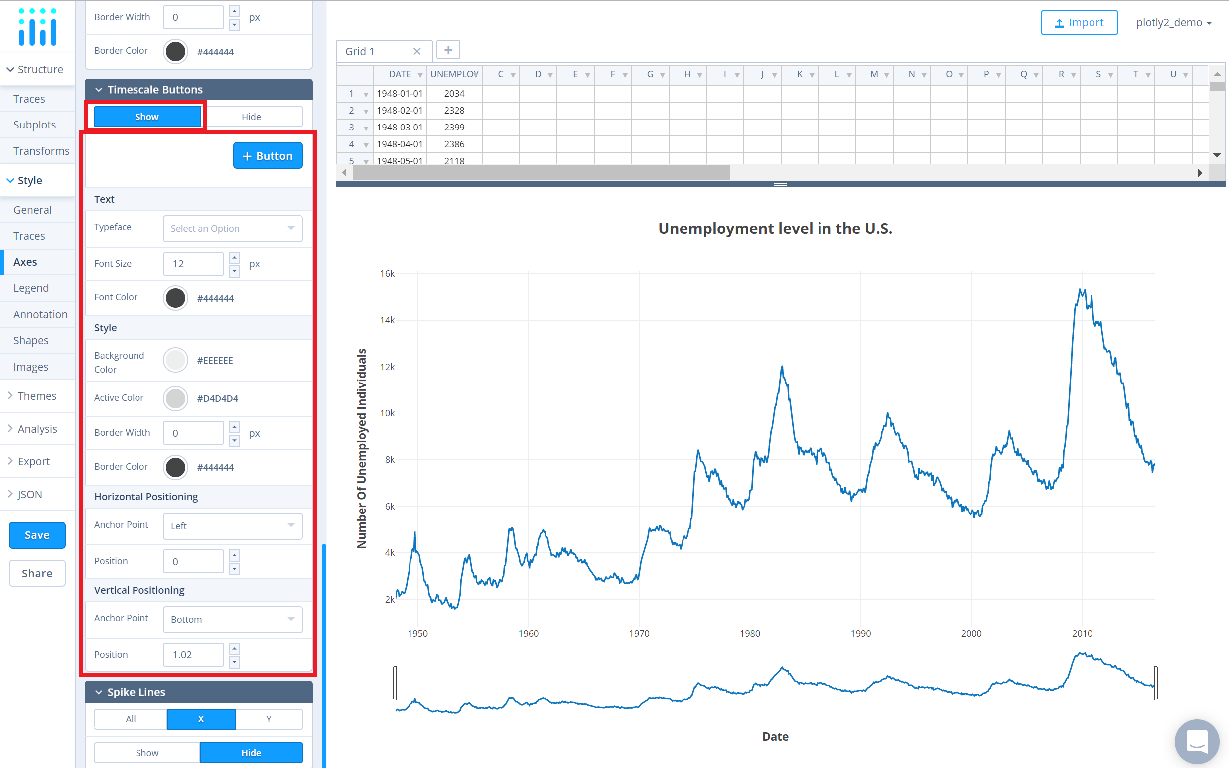
In addition to range slider, you can also add timescale button(s) to your chart. Timescale buttons, upon clicking them, allows you to display a specific range of the plot associated with that button. Please note that this property is only available when the date axis is properly formatted, refer to this helpful page for more information on formatting dates in Chart Studio.
After formatting the date and/or time axis, click 'Show' under the 'Timescale Buttons' property in the same 'Axes' section. This will display the styling options for the timescale buttons which will be added next.
Now, click on the '+ Button' button to add a new timescale button. This will display a panel containing the attributes associated with that timescale button: 'Label', 'Count', 'Step' and 'Stepmode'.
The atttribute 'Label' represents the text label to appear on the button, 'Count' represents the number of steps to take to update the range, 'Step' represents the unit of measurement, and 'Stepmode' allows to set the range update mode between 'Backward' and 'To Date'.
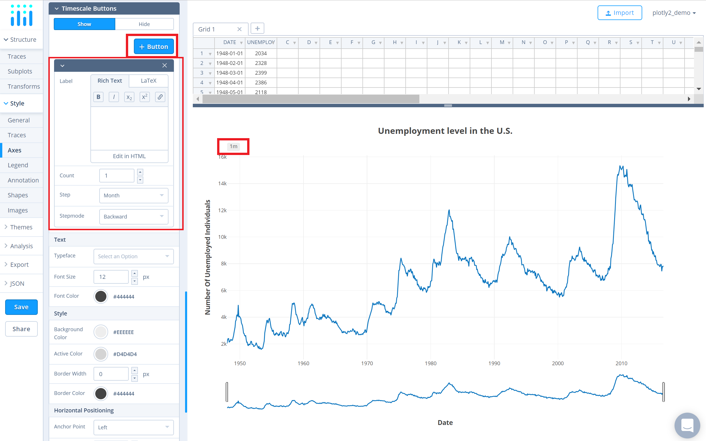
If 'Backward' is chosen as 'Stepmode', the range update shifts the start of range back by 'Count' times 'Step'.
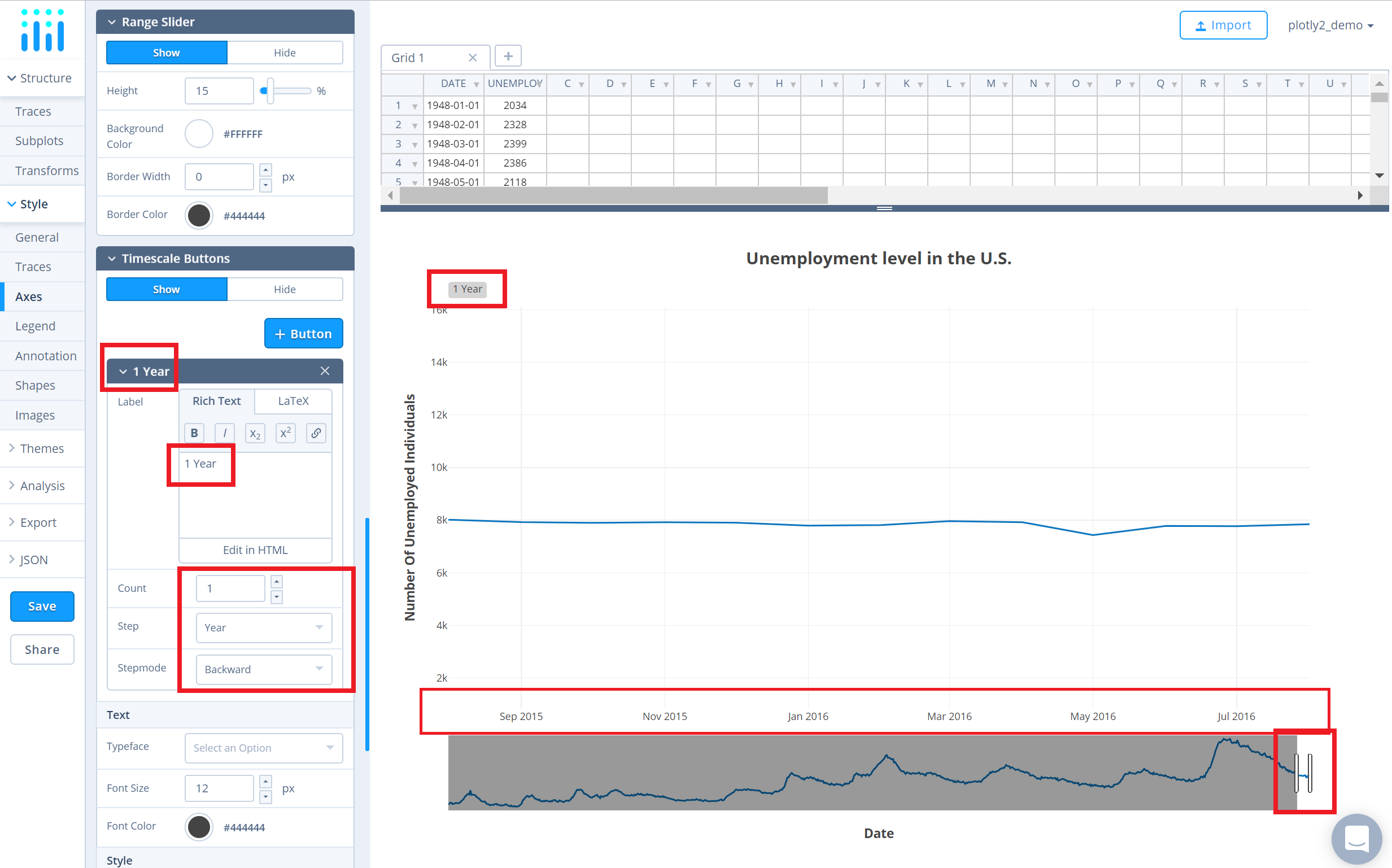
If 'To Date' is chosen, the range update shifts the start of range back to the first timestamp from 'Count' times 'Step' back. For example, with 'Step' set to 'Year' and count set to 1, the range update shifts the start of the range back to January 01 of the current year of the most recent date.
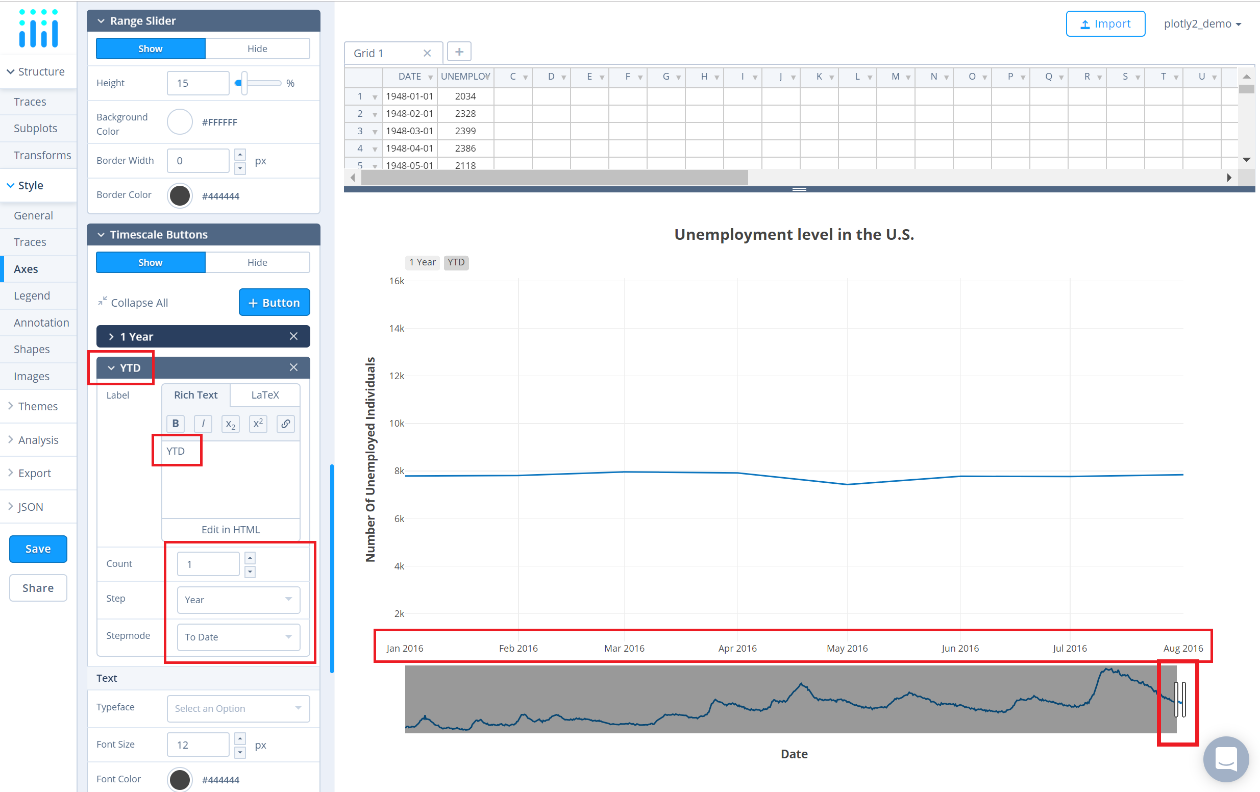
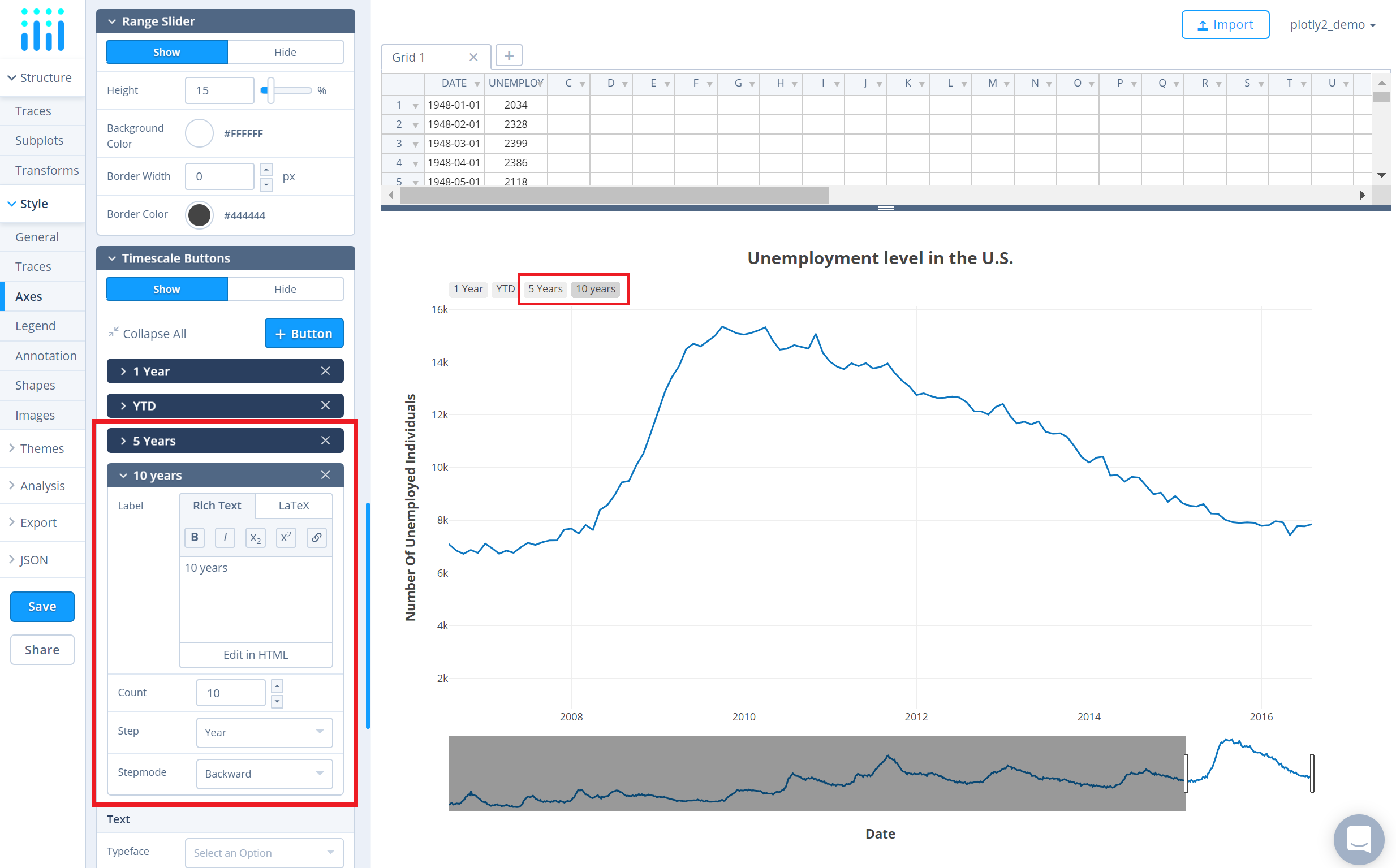
Add more buttons by clicking the '+ Button' button.
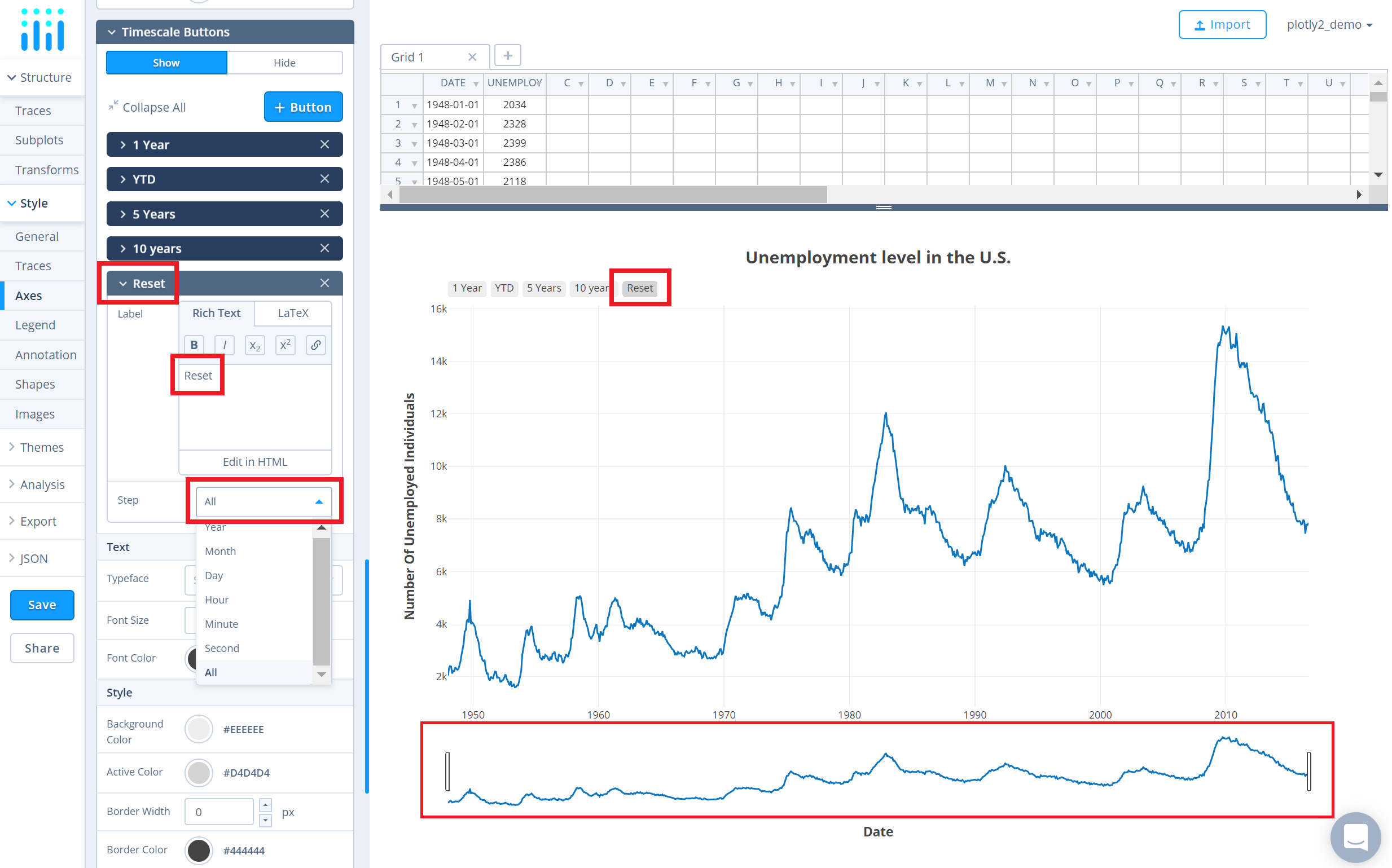
For adding a 'Reset' button that resets the slider's range after you've clicked on a specific timescale button, set the 'Step' attribute to 'All' from the dropdown.
Finally, set the styling options for the timescale buttons via the attributes available below the button panels.
Save and Share
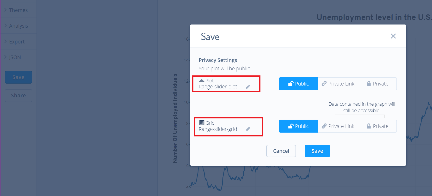
To save the plot click the 'Save' button on the left-hand side. A save modal will appear, as seen below, where you can specify the filenames and privacy settings for your plot and data grid.
For more information on privacy settings and how sharing works, visit Chart Studio's sharing tutorial.

