Make a Time Series (with Error Bars) Online with Chart Studio and Excel
Time Series Charts with Chart Studio
Upload your Excel data to Chart Studio's grid
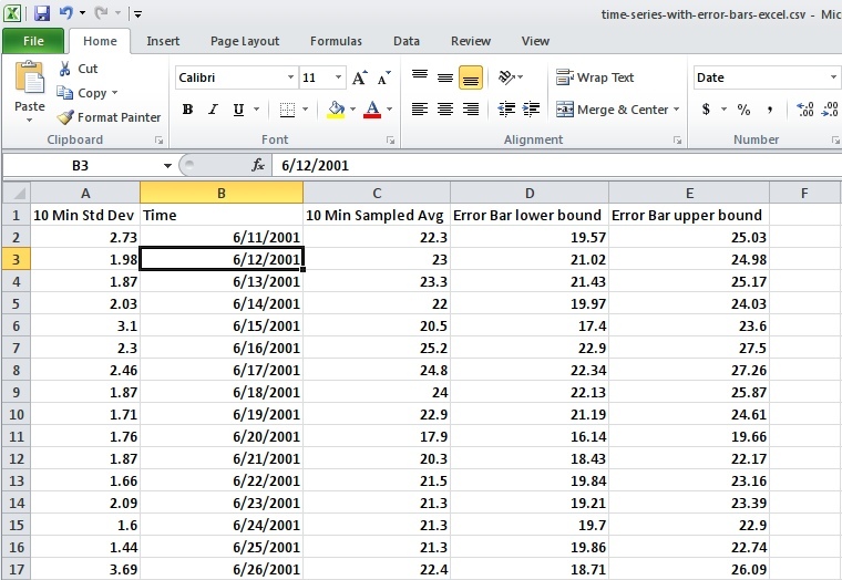
Open the data file for this tutorial in Excel. You can download the file here in CSV format
Head to Chart Studio
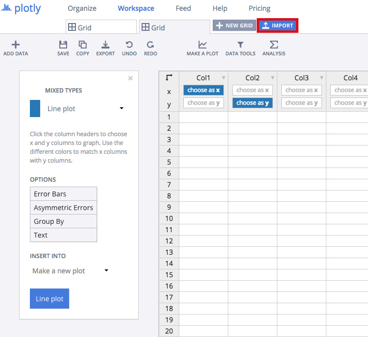
Head to the Chart Studio Workspace and sign into your free Chart Studio account. Go to 'Import', click 'Upload a file', then choose your Excel file to upload. Your Excel file will now open in Chart Studio's grid. For more about Chart Studio's grid, see this tutorial
Creating the Chart
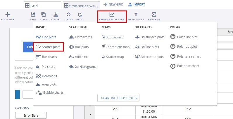
After importing the data, select the 'scatter plots' option from 'Choose Plot Type' dropdown.
From the left plot menu, choose the 'Asymmetric Errors' option, and then select the data shape as shown in the figure. Finally click on the 'Scatter Plot' button to generate the chart.
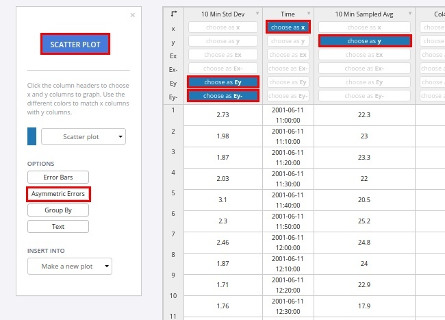
This will create a scatter plot along with the error bars. We will also add some styling to make it more presentable.
Styling the Chart
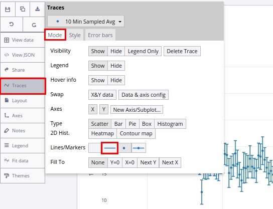
In the Traces popover, select the mode to 'lines' from the 'mode' tab.
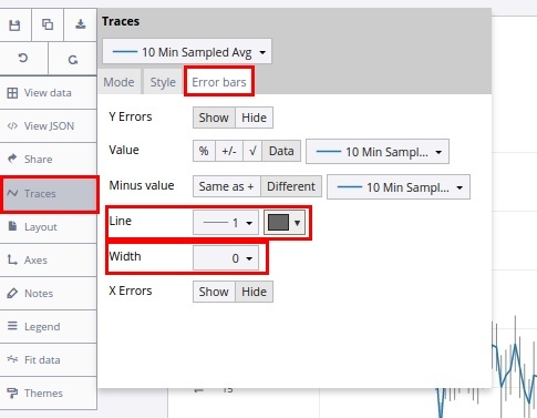
Now, we will modify the error bars. In the 'Traces' popover, select the 'error-bars' tab. Set the line to '1', and to a suitable colour. Also, set the line width to zero.
Export & Share
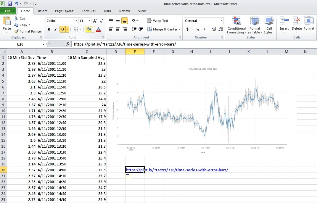
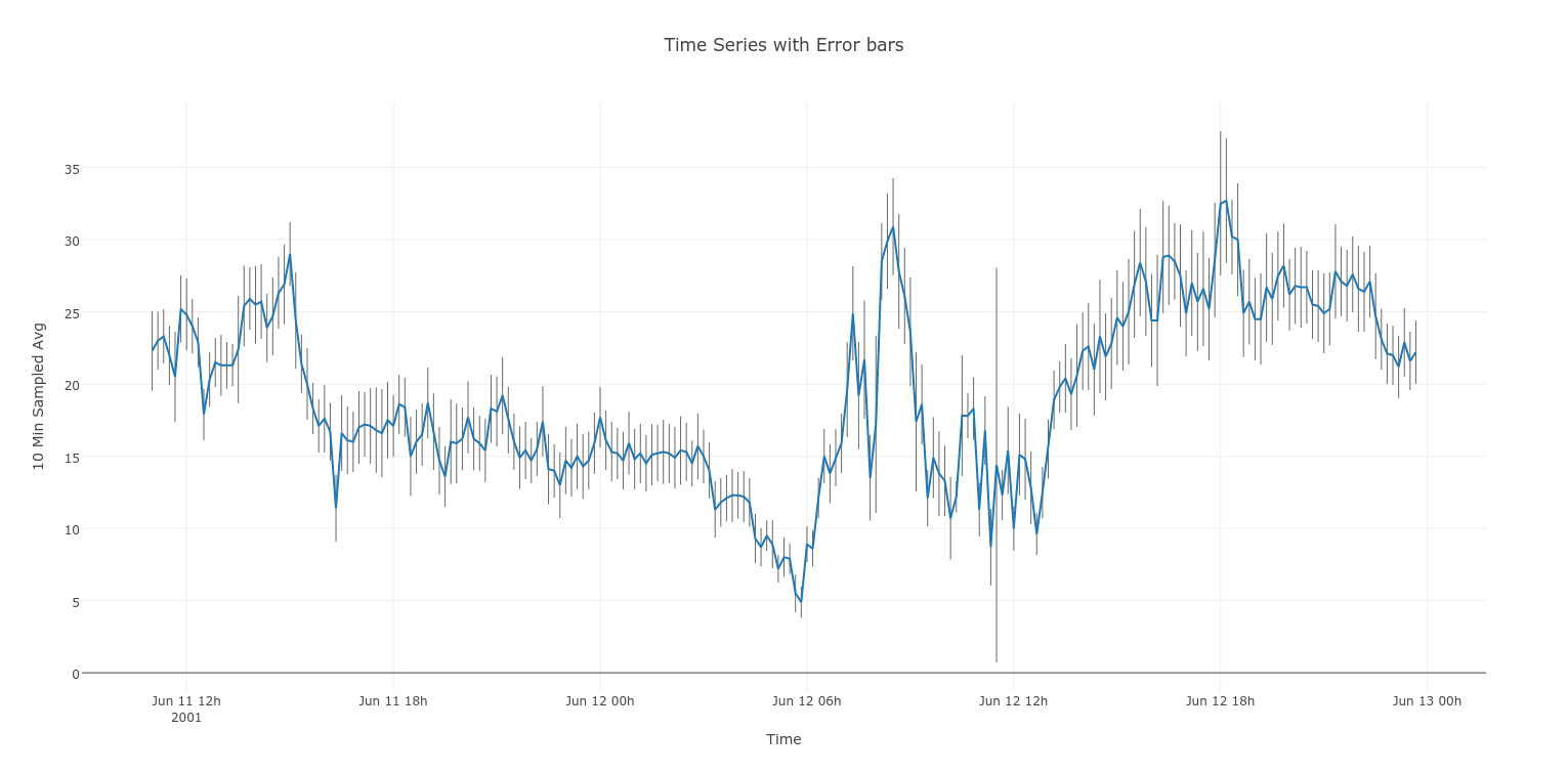
The final chart should look like the one below.
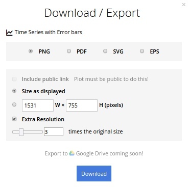
Download an image of your Chart Studio graph by clicking EXPORT on the toolbar.
To add the chart inside an excel sheet, click where you want to insert the picture inside Excel. On the INSERT tab inside Excel, in the ILLUSTRATIONS group, click PICTURE. Locate the Chart Studio graph image that you downloaded and then double-click it. Notice that we also copy-pasted the Chart Studio graph link in a cell for easy access to the interactive Chart Studio version.