Three Y Axes Graph with Chart Studio and Excel
A Step by Step Guide to Making a Graph with Three Y Axes With Chart Studio and Excel
Upload your Excel data to Chart Studio's grid
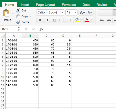
Open the data file for this tutorial in Excel. You can download the file here in CSV format
Head to Chart Studio
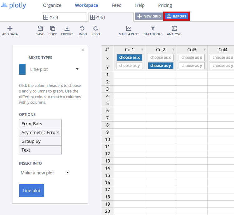
Head to the Chart Studio Workspace and sign into your free Chart Studio account. Go to 'Import', click 'Upload a file', then choose your Excel file to upload. Your Excel file will now open in Chart Studio's grid. For more about Chart Studio's grid, see this tutorial
Creating Your Chart
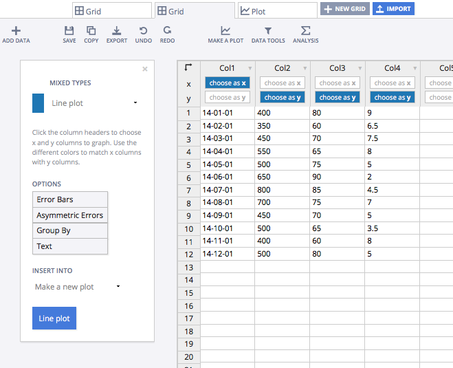
Label your columns like we did below. You'll have three y-axis columns (cost, output, defective) and one x-axis column (date). Select 'Line plots' from the MAKE A PLOT menu and then click line plot in the bottom left.
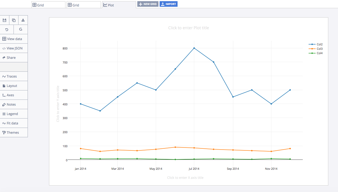
Your plot would initially look something like this.
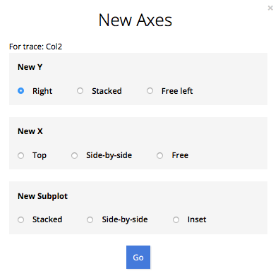
Head to the TRACES popover and access Col2. Prepare to add the second y-axis. Click 'New Axis/Subplot…'
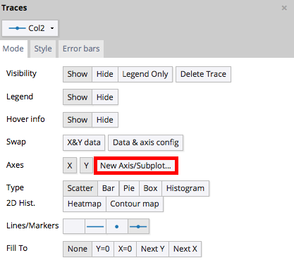
You'll want to apply your new y-axis to the right side of the graph.
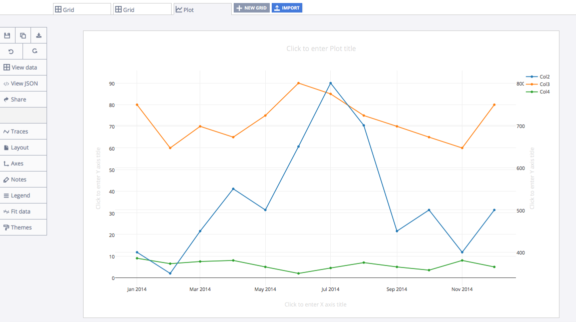
Your graph should now look something like this:
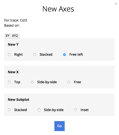
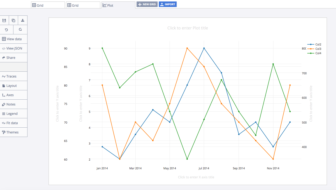
Now, we'll peform a similar process for Col3. Instead of applying third y-axis to the right side of the graph, choose 'free left' instead.
Your graph should now look something like this:
Finalizing Your Graph
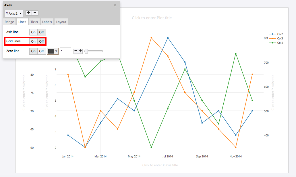
You might notice that the y-axis is busy with grid lines. Open the AXES popover, then Lines in the toolbar to clean this up. Select the first and second y-axes and turn grid lines 'off.'
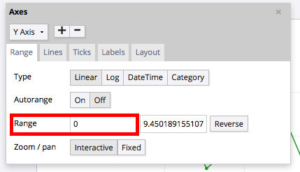
Next, ensure that all your y-axes range starts at 0. Open the Axes popover, then Range and adjust it to 0. Do this for all y-axes.
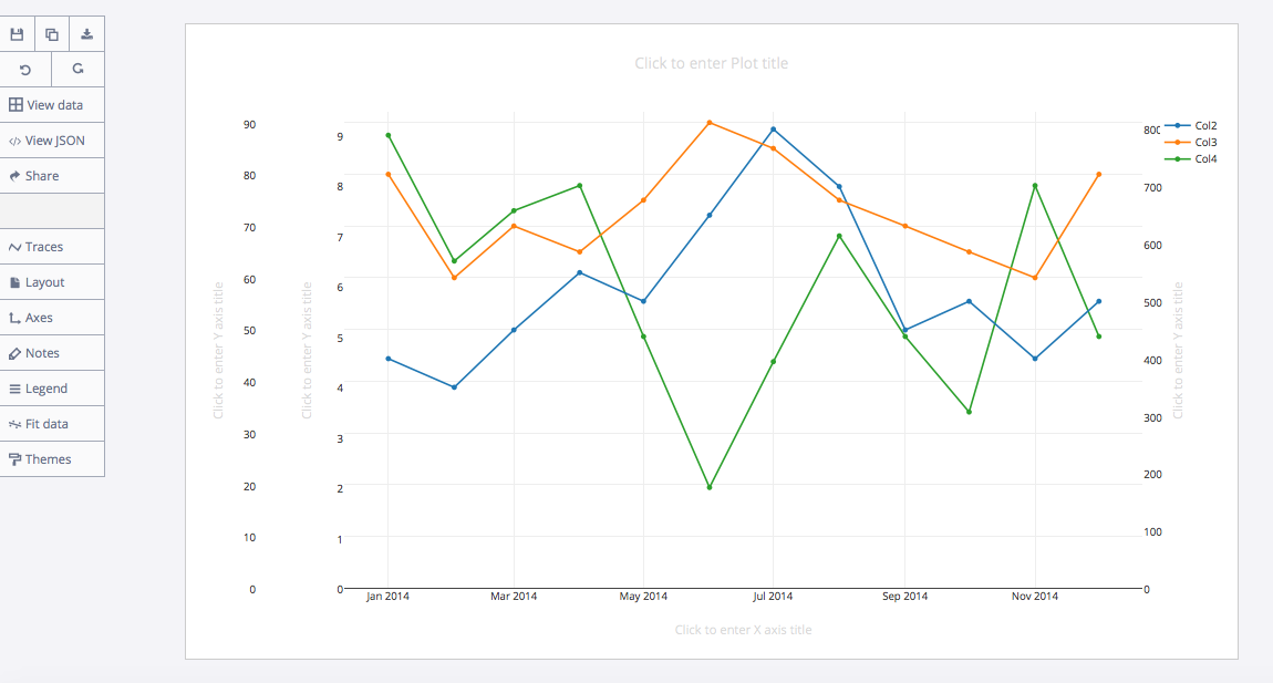
Your graph should now look something like this:
Within the legend on the right side of the graph, you can label your 'Col2' trace 'Cost,' Col3 'Output' and Col4 'Defective.'
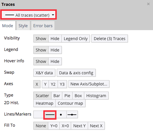
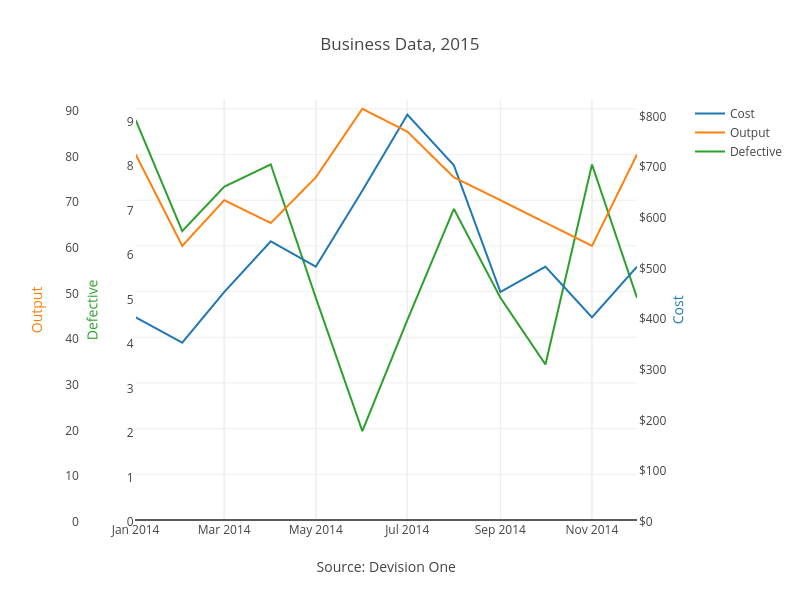
Your plot should now look something like this. In order to get the graph at the top of the tutorial, you’ll need to style it a little more. You can adjust the 'Lines/Markers' within the TRACES popover.
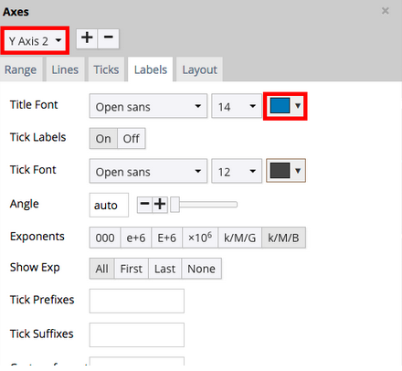
We’ve titled our chart. We've also colored-coded our y-axis labels to our traces. You can even add 'Tick Prefixes' within the AXES popover and 'Labels' tab. If you feel so moved, you can even color-code the 'ticks' to your traces. Finally, we’ve linked to our source data in the x-axis label area.
You can download your finished Chart Studio graph to embed in your Excel workbook. We also recommend including the Chart Studio link to the graph inside your Excel workbook for easy access to the interactive Chart Studio version. Get the link to your graph by clicking the 'Share' button. Download an image of your Chart Studio graph by clicking EXPORT on the toolbar.
To add the Excel file to your workbook, click where you want to insert the picture inside Excel. On the INSERT tab inside Excel, in the ILLUSTRATIONS group, click PICTURE. Locate the Chart Studio graph image that you downloaded and then double-click it. Notice that we also copy-pasted the Chart Studio graph link in a cell for easy access to the interactive Chart Studio version.

