Make a Chart with an Inset Plot with Chart Studio and Excel
Chart with an Inset Plot with Chart Studio
Upload your Excel data to Chart Studio's grid
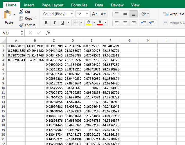
Open the data file for this tutorial in Excel. You can download the file here in CSV format
Head to Chart Studio
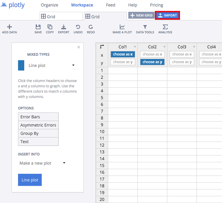
Head to the Chart Studio Workspace and sign into your free Chart Studio account. Go to 'Import,' click 'Upload a file,' then choose your Excel file to upload. Your Excel file will now open in Chart Studio's grid. For more about Chart Studio's grid, see this tutorial
Creating Your Chart
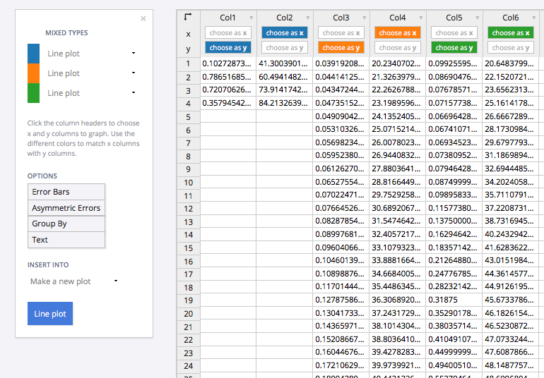
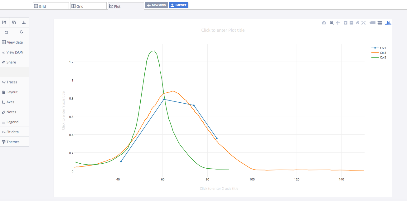
Label your columns like we did below. You'll have three different x-y datasets (margin of error, photon density/energy, electron energy/density). Select 'Line plots' from the MAKE A PLOT menu and then click line plot in the bottom left.
Your plot would initially look something like this.
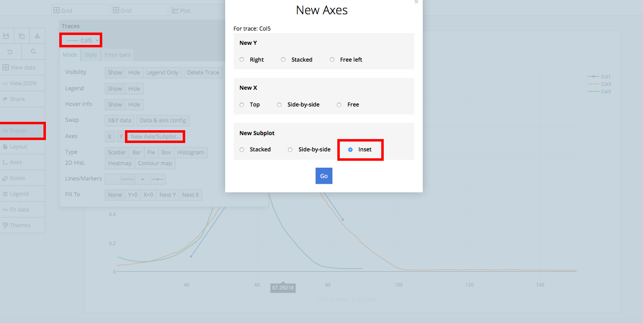
Head to the TRACES popover and access Col5 from the dropdown menu. From 'Axes' you'll want to click New Axis/Subplot bar. From New Axis/Subplot you'll want to click 'Inset' under New Subplot.
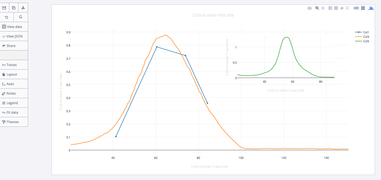
Your plot would then look something like this.
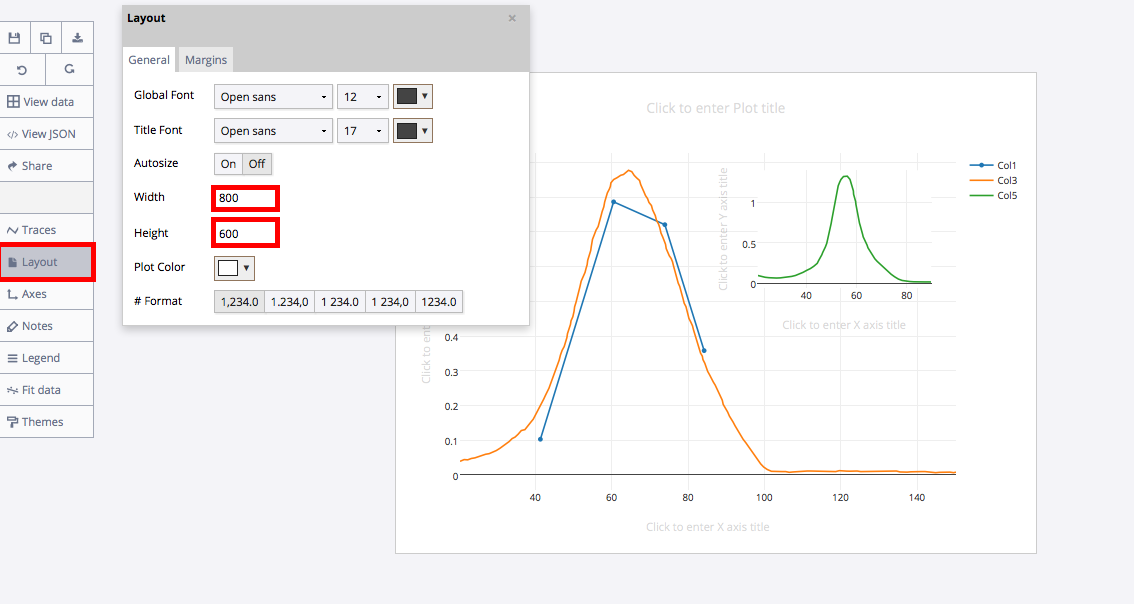
Take a moment to resize your plot to something less wide. A width of 800 and a height of 600 seems reasonable. Head to the layout menu to do this.
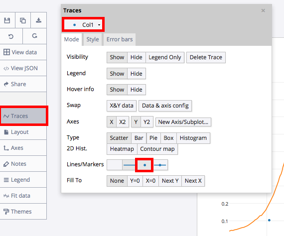
Now, head to the TRACES popover again and access Col1 from the dropdown menu. For these data points, you'll want to remove the line from the marker. This will get you a plot closer to our version.
Then, within the same popover and column, head to the error bar menu. Show both the x and y error bars. You'll immediately notice the change on your graph.
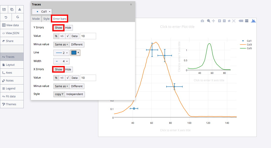
You can play with the 'Value' option within the error bar menu to get the bars to a length of your liking.
Finalizing Your Graph
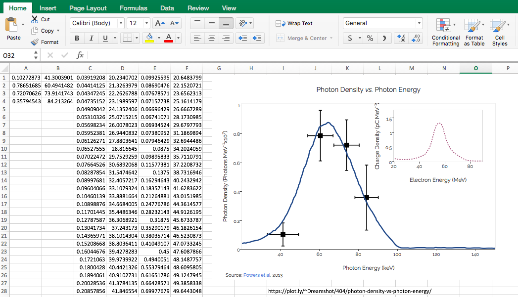
Adding titles to the x and y axis of your original plot and inset plot are important, as is an overall title for your plot. After titling your plot, it should look something like this.

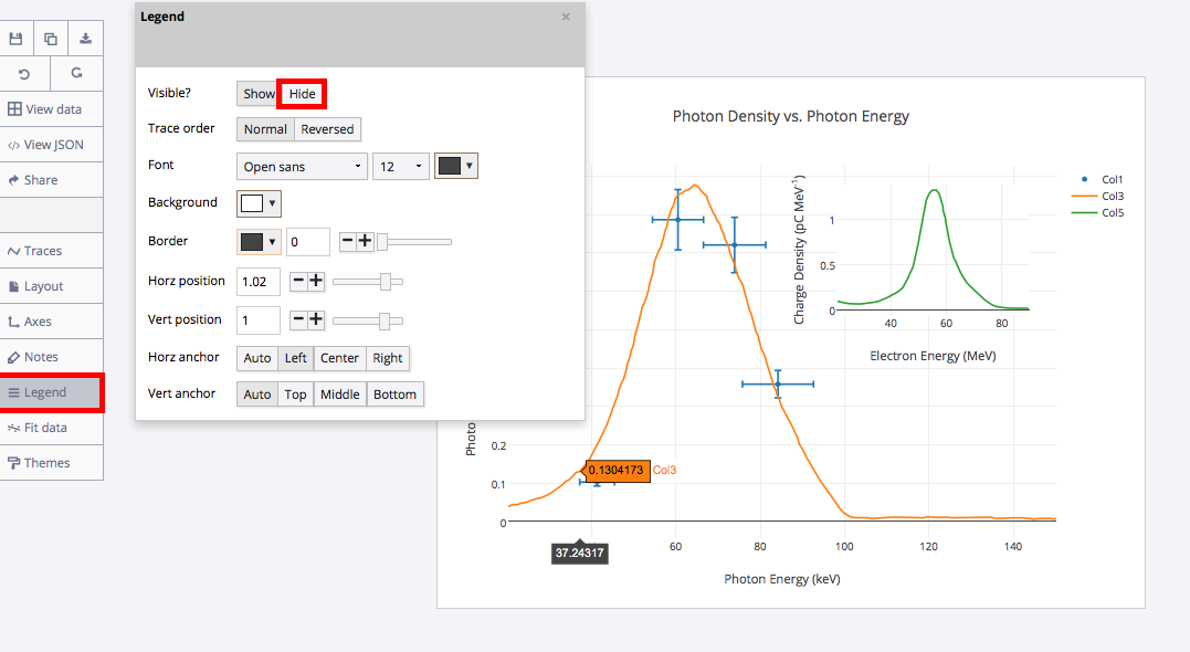
Head to the LEGEND popover. From there, you can hide your legend; it isn't really an important part of this graph.
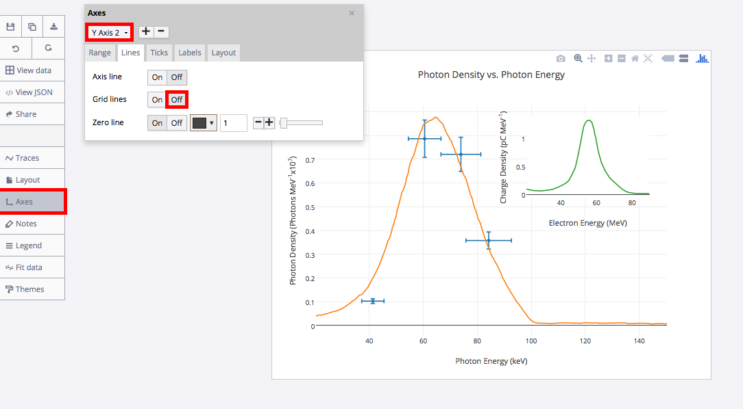
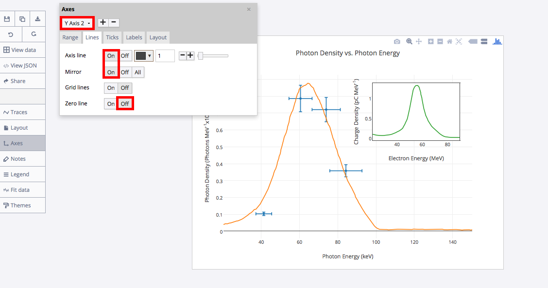
You might notice that the grid lines on the inset plot clash with the grid lines of your original plot. Head to the AXES popover, then select X Axis 2 (Y Axis 2) from the drop down menu. Head to 'lines' and turn the grid lines off.
In order to get a distinguished inset 'boxed-in' look, you can turn the Axis line and Mirror on in the case of X Axis 2 (Y Axis 2) and also turn the Zero line off in both cases.
Finalizing your Graph
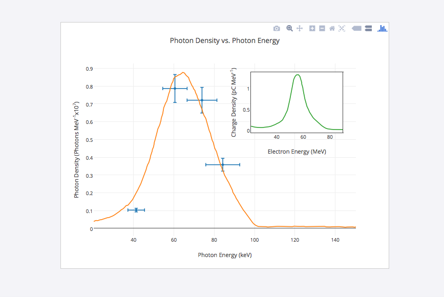
Your plot should now look something like this. In order to get the graph at the top of the tutorial, you’ll need to style it a little more.
We used a note to link to our source data. You can download your finished Chart Studio graph to embed in your Excel workbook. We also recommend including the Chart Studio link to the graph inside your Excel workbook for easy access to the interactive Chart Studio version. Get the link to your graph by clicking the 'Share' button. Download an image of your Chart Studio graph by clicking EXPORT on the toolbar.
To add the Excel file to your workbook, click where you want to insert the picture inside Excel. On the INSERT tab inside Excel, in the ILLUSTRATIONS group, click PICTURE. Locate the Chart Studio graph image that you downloaded and then double-click it. Notice that we also copy-pasted the Chart Studio graph link in a cell for easy access to the interactive Chart Studio version.