Edit chart
Loading graph
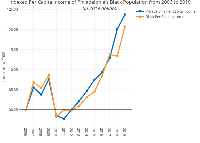
Mshields417's interactive graph and data of "Indexed Per Capita Income of Philadelphia's Black Population from 2006 to 2019(in 2019 dollars)" is a line chart, showing Philadelphia Per Capita Income vs Black Per Capita Income; with Indexed to 2006 in the y-axis. The x-axis shows values from 0 to 0. The y-axis shows values from 0 to 0.