Edit chart
Loading graph
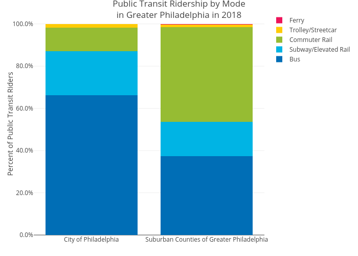
Mshields417's interactive graph and data of "Public Transit Ridership by Modein Greater Philadelphia in 2018" is a stacked bar chart, showing Bus, Subway/Elevated Rail, Commuter Rail, Trolley/Streetcar, Ferry; with Percent of Public Transit Riders in the y-axis. The x-axis shows values from 0 to 0. The y-axis shows values from 0 to 0.