Edit chart
Loading graph
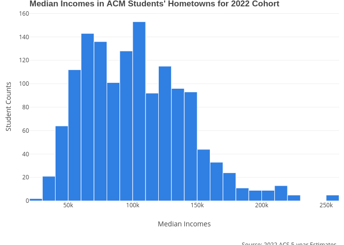
Melissajuarezc's interactive graph and data of "Median Incomes in ACM Students' Hometowns for 2022 Cohort" is a histogram; with Median Incomes in the x-axis and Student Counts in the y-axis.. The x-axis shows values from 0 to 0. The y-axis shows values from 0 to 0. This visualization has the following annotation: Source: 2022 ACS 5-year Estimates,SREB's ACM Data