Edit chart
Loading graph
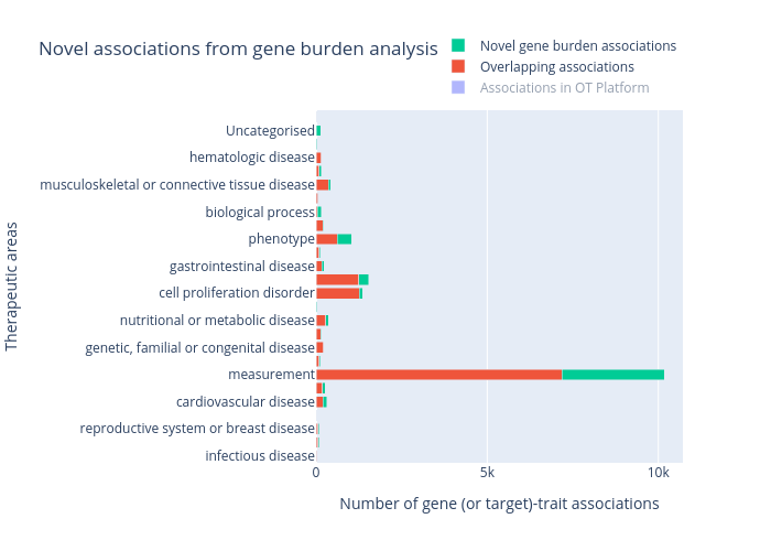
Irenelopezs's interactive graph and data of "Novel associations from gene burden analysis" is a stacked bar chart, showing Associations in OT Platform, Overlapping associations, Novel gene burden associations; with Number of gene (or target)-trait associations in the x-axis and Therapeutic areas in the y-axis.. The x-axis shows values from 0 to 0. The y-axis shows values from 0 to 0.