Edit chart
Loading graph
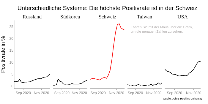
Florian.eblenkamp's interactive graph and data of "Unterschiedliche Systeme: Die höchste Positivrate ist in der Schweiz" is a line chart; with Positivrate in % in the y-axis. The x-axis shows values from 2020-08-02 to 2020-11-30. The y-axis shows values from -1 to 27.755555555555556. This visualization has the following annotations: ; Russland; Südkorea; Schweiz; Taiwan; USA; Fahren Sie mit der Maus über die Grafik,um die genauen Zahlen zu sehen.